ACT Science Quiz: Interpreting Data From Graphs
20 questions · exam conditions
0:00
Interpreting Data From GraphsQuestion 1 of 20

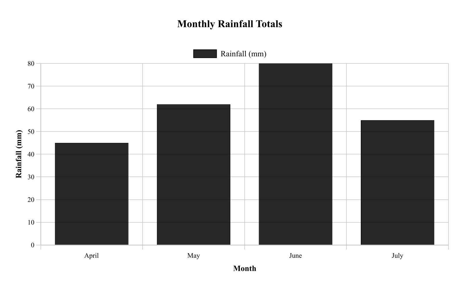
A meteorologist compared total rainfall across four months at one location. Figure 1 shows monthly rainfall totals. According to the graph, which month had rainfall closest to 60 mm?

Bar heights are approximately: April 45 mm, May 62 mm, June 80 mm, July 55 mm. Caption: Each bar represents the total rainfall measured for that month; values can be compared by bar height.
Question graphic
May
June
July
April
← Back to quizzes

ACT Science Quiz

ACT Science Quiz: Interpreting Data From Graphs

Practice Interpreting Data From Graphs in ACT Science with focused quiz questions that help you check what you know, review explanations, and build confidence with test-style prompts.

What this quiz covers

This quiz focuses on Interpreting Data From Graphs, giving you a quick way to practice the rules, question types, and explanations that matter most for ACT Science.

How to use this quiz

Try each quiz question before looking at the correct answer. Use the explanations to review missed ideas, then come back to similar questions until the pattern feels familiar.

All questions

Question 1

A meteorologist compared total rainfall across four months at one location. Figure 1 shows monthly rainfall totals. According to the graph, which month had rainfall closest to 60 mm?

Bar heights are approximately: April 45 mm, May 62 mm, June 80 mm, July 55 mm. Caption: Each bar represents the total rainfall measured for that month; values can be compared by bar height.

  1. May (correct answer)
  2. June
  3. July
  4. April

Explanation: The bar graph compares rainfall totals for April (45 mm), May (62 mm), June (80 mm), and July (55 mm). May's bar at 62 mm is closest to 60 mm, as it's only 2 mm above while others differ more. This is correct because comparing bar heights to the target value identifies the nearest, demonstrating bar graph comparison. Option C, July at 55 mm, is close but farther from 60 than May.

Question 2

Biologists observed bacterial population growth in a nutrient broth over several hours. Figure 1 shows population size versus time. If the trend from 4 to 8 hours continues to 10 hours, what population size would be the best estimate at 10 hours?

Points are (0, 1), (2, 2), (4, 4), (6, 8), and (8, 16), connected by straight segments. Caption: The population approximately doubles every 2 hours over the interval shown; extrapolation beyond 8 hours assumes the same doubling pattern continues.

  1. 18 million cells
  2. 20 million cells
  3. 24 million cells
  4. 32 million cells (correct answer)

Explanation: The graph depicts bacterial population doubling every 2 hours, from 1 at 0 h, to 2 at 2 h, 4 at 4 h, 8 at 6 h, and 16 at 8 h. Extrapolating the trend to 10 h gives 32 million cells, as it doubles from 16. This is correct because continuing the pattern assumes the same growth rate, illustrating extrapolation from graphs. Option C, 24 million, might result from adding instead of multiplying.

Question 3

A student monitored the temperature of a cooling metal rod after it was removed from an oven and left at room conditions. Figure 1 shows the rod's temperature versus time. Use the graph to determine the temperature at a specific time.

The curve decreases rapidly at first and then more slowly, passing through approximately (0, 200), (5, 120), (10, 85), (15, 65), and (20, 55). Caption: Temperature measurements were taken every 5 minutes as the rod cooled; points are connected to show the trend.

  1. 55 °C
  2. 85 °C (correct answer)
  3. 65 °C
  4. 120 °C

Explanation: The graph shows the temperature of the cooling rod decreasing over time, with the curve passing through points like (0, 200), (5, 120), (10, 85), (15, 65), and (20, 55). To find the temperature at 10 minutes, follow the x-axis to 10 min, go up to the curve, and read across to the y-axis, which gives approximately 85 °C. This is correct because the graph directly indicates 85 °C at that point, demonstrating how to read a specific value from a line graph. Option C, 65 °C, might be chosen if someone misreads the time as 15 minutes instead.

Question 4

A student measured the speed of a cart rolling down different ramp angles. Figure 1 plots cart speed versus ramp angle. Based on the scatter plot, which statement best describes the relationship between ramp angle and cart speed?

  1. Speed generally increases as ramp angle increases. (correct answer)
  2. Speed remains constant across all ramp angles.
  3. Speed generally decreases as ramp angle increases.
  4. Speed increases up to 15° then decreases after 15°.

Explanation: The scatter plot shows cart speed increasing with ramp angle, with points clustering around (5, 0.6), (10, 1.0), (15, 1.4), (20, 1.9), (25, 2.3), and (30, 2.8). The overall trend is a steady rise, best described as speed generally increasing as ramp angle increases. This is correct because the pattern of points demonstrates a positive correlation, illustrating how to interpret trends in scatter plots. Option D might mislead if someone sees a false peak at 15° due to not viewing the full trend.

Question 5

An ecologist counted the number of insects observed in 5 different habitats during a 1-hour survey. Figure 1 shows the counts.

According to Figure 1, which habitat had the fewest insects observed?

  1. Desert (correct answer)
  2. Forest
  3. Garden
  4. Field

Explanation: The Desert habitat had the fewest insects observed according to Figure 1. Comparing the bar heights for all five habitats (Field, Forest, Pond, Garden, Desert), the Desert bar is clearly the shortest, indicating the lowest insect count during the 1-hour survey period.

Question 6

A student measured the speed of a falling object at different times after release. Figure 1 shows speed versus time.

According to Figure 1, the speed at 1.5s1.5 \, \text{s} is closest to:

  1. 5m/s5 \, \text{m/s}
  2. 15m/s15 \, \text{m/s} (correct answer)
  3. 10m/s10 \, \text{m/s}
  4. 20m/s20 \, \text{m/s}

Explanation: The speed at 1.5s1.5 \, \text{s} is closest to 15m/s15 \, \text{m/s}. To find this value in Figure 1, locate 1.5s1.5 \, \text{s} on the x-axis, interpolate between the plotted points on the increasing trend line, then read across to the y-axis. The linear relationship shows speed increasing uniformly with time for the falling object.

Question 7

An ecologist compared the average number of insects captured per trap in four habitats during the same week. Figure 1 shows the mean insects per trap for each habitat. Which habitat had the highest mean capture?

  1. Wetland (correct answer)
  2. Grassland
  3. Urban
  4. Forest

Explanation: Read the bar heights straight off the graph: Forest 18, Grassland 12, Wetland 25, and Urban 9 mean insects per trap. The wetland habitat has the tallest bar at 25, so it recorded the highest mean capture. Forest, at 18, is the runner-up and is the easiest trap to fall into if you grab the second-tallest bar or misread which bar you are on. Grassland at 12 and Urban at 9 are both clearly lower. With a bar graph comparison like this, find the value for every category before choosing, then pick the largest.

Question 8

PASSAGE I

CHEMISTRY/PHYSICS: Data Representation

Introduction

Viscosity is a measure of a fluid's resistance to flow. Fluids with high viscosity flow slowly, while fluids with low viscosity flow quickly. The viscosity of a liquid typically decreases as its temperature increases. Students investigated the viscosity of four different synthetic motor oils (Oils W, X, Y, and Z) by measuring the time it took for a solid steel ball to drop through a 50-centimeter (cm) vertical glass cylinder filled with the oil.

Study 1

The students recorded the drop time, in seconds (s), for the steel ball in each of the four oils at 20C20^\circ\text{C}, 40C40^\circ\text{C}, 60C60^\circ\text{C}, and 80C80^\circ\text{C}. The results are shown in Figure 1.

Study 2

The students also looked up the established viscosity values, measured in millipascal-seconds (mPa·s), for each oil at 40C40^\circ\text{C} and 100C100^\circ\text{C}. The results are shown in Table 1.

Based on Figure 1, as the temperature of the oils increased from 20°C to 80°C, the drop time of the steel ball:

  1. increased only.
  2. decreased only. (correct answer)
  3. increased, then decreased.
  4. remained constant.

Explanation: The correct answer is B (decreased only). All four oil curves in Figure 1 slope consistently downward from left to right — as temperature increases from 20°C to 80°C, drop time decreases for every oil tested. This is consistent with the passage's introduction, which states that viscosity decreases as temperature increases, and since lower viscosity means the ball falls faster, drop time decreases. A (increased only) and C (increased, then decreased) are contradicted by the uniformly downward-sloping curves. D (remained constant) would require flat horizontal lines, which is not shown. On trend questions, check all curves to confirm the trend is consistent — here all four oils show the same directional pattern.

Question 9

PASSAGE I

EARTH SCIENCE: Data Representation

Earth's atmosphere is divided into distinct layers based on how temperature changes with altitude. The boundary between each layer is called a pause (e.g., the tropopause separates the troposphere from the stratosphere). Figure 1 shows how average atmospheric temperature varies with altitude. Table 1 shows how average atmospheric pressure, measured in atmospheres (atm), changes with altitude.

Based on Figure 1, in which of the following atmospheric layers does temperature decrease as altitude increases?

  1. Troposphere and Mesosphere only (correct answer)
  2. Stratosphere and Thermosphere only
  3. Troposphere and Stratosphere only
  4. Mesosphere and Thermosphere only

Explanation: The correct answer is A. Figure 1 shows temperature decreasing with altitude in two layers: the Troposphere (from 15°C at the surface down to −60°C at 12 km) and the Mesosphere (from 0°C at 50 km down to −90°C at 85 km). The Stratosphere shows increasing temperature with altitude (−60°C to 0°C), as does the Thermosphere (temperature increases rapidly above 85 km). B is wrong because both the Stratosphere and Thermosphere show temperature increasing with altitude. C is wrong because the Stratosphere shows temperature increasing, not decreasing. D is wrong because the Thermosphere shows temperature increasing. Pro tip: Read each layer's description carefully and classify it as either warming or cooling with altitude before looking at the answer choices.

Question 10

PASSAGE I

EARTH SCIENCE: Data Representation

Earth's atmosphere is divided into distinct layers based on how temperature changes with altitude. The boundary between each layer is called a pause (e.g., the tropopause separates the troposphere from the stratosphere). Figure 1 shows how average atmospheric temperature varies with altitude. Table 1 shows how average atmospheric pressure, measured in atmospheres (atm), changes with altitude.

According to Figure 1, the temperature at an altitude of 30 km is closest to:

  1. −80°C
  2. −40°C (correct answer)
  3. 0°C
  4. 15°C

Explanation: The correct answer is B. An altitude of 30 km falls within the Stratosphere (12–50 km), where temperature increases from −60°C at 12 km to 0°C at 50 km. At 30 km, which is roughly the midpoint of this layer, the temperature is approximately −40°C. A (−80°C) is too cold — that value is closer to the Mesopause at 85 km. C (0°C) is the temperature at the Stratopause (50 km), not at 30 km. D (15°C) is the surface temperature at sea level. Pro tip: On atmospheric layer questions, first identify which layer the altitude falls in, then use the layer's temperature range to narrow your answer.

Question 11

PASSAGE III

EARTH SCIENCE / BIOLOGY: Conflicting Viewpoints

Introduction

Approximately 66 million years ago, a mass extinction event occurred at the boundary between the Cretaceous and Paleogene periods (the K-Pg boundary), wiping out roughly 75% of all plant and animal species on Earth, including all non-avian dinosaurs. Geologists have discovered a distinct layer of sedimentary rock worldwide at the K-Pg boundary that contains unusually high levels of iridium, a metal rare in Earth's crust. Two scientists present different hypotheses for the cause of the extinction and the source of the iridium.

Scientist 1

The mass extinction was caused by the impact of a massive asteroid, approximately 10 kilometers in diameter. Asteroids are naturally rich in iridium. When the asteroid struck the Earth, the immense force of the collision vaporized the asteroid and a large portion of Earth's crust, ejecting a massive cloud of iridium-rich dust and debris into the atmosphere. This dust cloud enveloped the planet for months or even years, blocking out incoming sunlight. The lack of sunlight halted photosynthesis globally, causing the collapse of marine and terrestrial food webs.

Furthermore, the impact would have triggered global wildfires, acid rain, and massive tsunamis. The presence of shocked quartz (quartz crystals deformed by intense, sudden pressure) and tektites (glassy spheres formed by rapidly cooling, ejected rock) in the K-Pg boundary layer alongside the iridium firmly points to a high-velocity extraterrestrial impact as the sole trigger of the extinction.

Scientist 2

The mass extinction was not caused by a sudden impact, but rather by intense, prolonged volcanic activity. Around 66 million years ago, a massive volcanic region in what is now India, known as the Deccan Traps, experienced a series of colossal eruptions that lasted for tens of thousands of years. These eruptions released millions of cubic kilometers of lava.

While iridium is rare in Earth's surface crust, it is present in high concentrations in the deep mantle. The massive magma plumes from the Deccan Traps brought this deep-Earth iridium to the surface, where volcanic ash plumes spread it globally. The prolonged eruptions released massive quantities of sulfur dioxide (SO2SO_2) and carbon dioxide (CO2CO_2) into the atmosphere. The SO2SO_2 caused severe short-term global cooling and acid rain, while the CO2CO_2 led to long-term extreme global warming. This resulting climate instability severely stressed ecosystems over thousands of years, leading to a gradual, rather than instantaneous, mass extinction. Shocked quartz can also be formed by the explosive pressures of massive volcanic eruptions.

According to Scientist 2, the high levels of iridium found in the K-Pg boundary layer originated from:

  1. the vaporization of an extraterrestrial asteroid.
  2. the remnants of burned dinosaur bones.
  3. magma plumes originating in Earth's deep mantle. (correct answer)
  4. chemical reactions between carbon dioxide and shocked quartz.

Explanation: The correct answer is C. Scientist 2's hypothesis explicitly states: 'it is present in high concentrations in the deep mantle. The massive magma plumes from the Deccan Traps brought this deep-Earth iridium to the surface, where volcanic ash plumes spread it globally.' The iridium source in Scientist 2's model is the deep mantle, transported upward by magma. A describes Scientist 1's explanation for the iridium — asteroid vaporization. B is a fabrication not mentioned by either scientist. D combines two real elements from the passage (CO₂ and shocked quartz) in a relationship that neither scientist proposes. On viewpoint-specific detail questions, confirm which scientist's passage you are reading before selecting an answer.

Question 12

PASSAGE V

ASTRONOMY / EARTH SCIENCE: Data Representation

Introduction

Astronomers classify stars based on their surface temperature and their luminosity. Surface temperature is measured in Kelvin (K). Luminosity is a measure of a star's total energy output compared to the Sun (LL_{\odot}). For example, a star with a luminosity of 102L10^2 L_{\odot} emits 100 times more energy than the Sun. The Hertzsprung-Russell (H-R) diagram shown in Figure 1 maps stars according to these two properties.

Study

Astronomers measured the properties of four specific stars, labeled A–D, located in different regions of the H-R diagram. Results are shown in Table 1.

An astronomer discovers a new star with a luminosity exactly 100 times greater than the Sun's and a surface temperature of 10,000 K. According to Figure 1, this star is most likely a:

  1. White Dwarf — because its high temperature of 10,000 K places it in the lower-left quadrant.
  2. Main Sequence star — because its temperature and luminosity place it within the diagonal band. (correct answer)
  3. Giant — because any star more luminous than the Sun must be a Giant or larger.
  4. Supergiant — because a luminosity 100 times greater than the Sun indicates an extremely massive star.

Explanation: The correct answer is B (Main Sequence star). A luminosity 100 times greater than the Sun translates to 10² L☉ on the logarithmic y-axis. Locating 10,000 K on the x-axis and 10² on the y-axis and finding their intersection places this star within the Main Sequence diagonal band — it is a moderately hot, moderately luminous star that falls squarely on the sequence. A is wrong — White Dwarfs are in the lower-left (hot and dim); 10² luminosity is far too bright for a White Dwarf. C is tempting because Giants are more luminous than the Sun, but the specific coordinates of 10,000 K and 10² place this star on the Main Sequence band, not in the Giants region. D is wrong — Supergiants have luminosities of 10⁵ or greater; 10² is far too modest. The key skill here is correctly converting '100 times greater' to 10² on the logarithmic scale before locating the star.

Question 13

PASSAGE V

Atmospheric Structure

Introduction

Earth's atmosphere is divided into four primary layers based on the way temperature changes with altitude. From lowest to highest, these layers are the troposphere, stratosphere, mesosphere, and thermosphere. The boundaries between these layers are known as "pauses" (e.g., the tropopause).

Researchers launched a series of weather balloons and sounding rockets to record the atmospheric pressure (in millibars, mb) and temperature (in °C) at various altitudes. The average data for a mid-latitude region is presented in Figure 1.

The relationship between atmospheric pressure and altitude is shown in Figure 2.

A weather balloon carrying instruments requires an atmospheric pressure of at least 10 mb to function properly. Based on Figure 2, what is the approximate maximum altitude the balloon can reach before its instruments fail?

  1. 85 km
  2. 30 km (correct answer)
  3. 50 km
  4. 12 km

Explanation: This is a logarithmic scale reading question combined with interpolation. The phrase "requires at least [value] to function properly" combined with "maximum altitude" signals you need to find where a threshold is crossed on a graph. To solve this, locate 10 mb on the x-axis of Figure 2. Note that this is a logarithmic scale, so the spacing between 1, 10, and 100 is not linear—10 mb is closer to 1 mb than you might think on a regular scale. Trace upward from 10 mb to the exponential pressure curve, then trace left to read the altitude: approximately 30 km. At 12 km (Choice D), pressure is still around 200 mb (well above 10 mb threshold). At 50 km (Choice C), pressure has dropped to ~1 mb (below the threshold). Choice A (85 km) has even lower pressure (~0.01 mb). Pro tip: Logarithmic scales can be tricky—each tick mark represents a power of 10. Practice finding values between the major gridlines by estimating the exponential spacing!

Question 14

A lab group tracked the concentration of dissolved oxygen (DO) in a stream across one day. Figure 1 shows DO concentration versus time. At what time is DO at its minimum value?

The curve decreases from about 9.0 at 0 h to 7.2 at 6 h, reaches a lowest point near 6.5 at 10 h, then rises to about 10.0 at 18 h and ends near 9.2 at 24 h. Caption: DO was measured periodically; the minimum corresponds to the lowest point on the plotted curve.

  1. 24 h
  2. 10 h (correct answer)
  3. 18 h
  4. 6 h

Explanation: The line graph shows dissolved oxygen concentration varying over 24 hours, decreasing to a low of about 6.5 mg/L at 10 h before rising again. The minimum value occurs at 10 h, as that's the lowest point on the curve. This is correct because tracing the curve to its lowest y-value and reading the x-axis gives 10 h, showing how to find minima on graphs. Option C, 18 h, could be mistaken if focusing on a high point instead.

Question 15

A student tracked the mass of a wet towel as it dried at room temperature. Figure 1 shows towel mass versus time.

According to Figure 1, the towel's mass at 15 min is closest to:

  1. 110 g
  2. 125 g (correct answer)
  3. 140 g
  4. 160 g

Explanation: The towel's mass at 15 min is closest to 125 g. To find this value in Figure 1, locate 15 min on the x-axis and trace up to the curve, then read across to the y-axis. The exponential decay curve shows rapid mass loss initially, and at 15 minutes the mass has decreased to approximately 125 g from its starting value.

Question 16

A physics student rolled a cart down a ramp and measured its speed at different distances from the start. Figure 1 shows speed versus distance.

According to Figure 1, the cart's speed increases the most (largest change in m/s) over which distance interval?

  1. 0–1 m (correct answer)
  2. 1–2 m
  3. 2–3 m
  4. 3–4 m

Explanation: The cart's speed increases the most over the 0–1 m distance interval. Examining Figure 1, compare the change in speed (vertical change) for each 1-meter interval. The steepest portion of the curve occurs in the first meter, where the cart accelerates most rapidly from rest, showing the largest increase in m/s per meter traveled.

Question 17

A student measured the density of different materials. Figure 1 shows the measured densities.

According to Figure 1, which material has the greatest density?

  1. Plastic
  2. Wood
  3. Glass (correct answer)
  4. Aluminum

Explanation: Glass has the greatest density according to Figure 1. Comparing the bar heights for all four materials (Aluminum, Glass, Wood, Plastic), the Glass bar extends highest on the y-axis, indicating it has the highest density value in g/cm³ among the tested materials.

Question 18

A student recorded the temperature of cooling coffee after it was poured into a mug. Figure 1 shows temperature versus time.

According to Figure 1, the coffee temperature at 12 min is closest to:

  1. 35 °C
  2. 45 °C (correct answer)
  3. 55 °C
  4. 70 °C

Explanation: The coffee temperature at 12 min is closest to 45°C. To find this value in Figure 1, locate 12 min on the x-axis, trace up to the exponential cooling curve, then read across to the y-axis. The curve shows rapid initial cooling followed by slower temperature decline, typical of cooling objects approaching room temperature.

Question 19

A student measured how the boiling point of water changes with altitude. Figure 1 shows boiling point versus altitude.

Based on Figure 1, the boiling point at 1,500 m altitude is closest to:

  1. 85 °C
  2. 90 °C
  3. 95 °C (correct answer)
  4. 100 °C

Explanation: The boiling point at 1,500 m altitude is closest to 95°C. To find this value in Figure 1, locate 1,500 m on the x-axis, then interpolate between the plotted points to estimate the corresponding boiling point on the y-axis. The downward trend shows that boiling point decreases with increasing altitude.

Question 20

A student measured the heart rate of a subject during exercise and recovery. Figure 1 shows heart rate versus time.

  1. 2 min
  2. 6 min (correct answer)
  3. 10 min
  4. 14 min

Explanation: The subject's heart rate is highest at 6 min according to Figure 1. Examining the line graph across the entire time period, the peak of the curve occurs at 6 minutes, representing the maximum heart rate during the exercise and recovery protocol.