All questions
Question 1
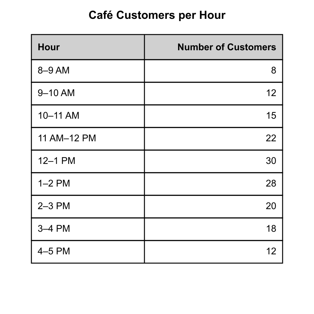
The frequency table below shows the number of customers who visited a café during each hour it was open on a particular day. Based on the table shown, what is the approximate mean number of customers per hour, rounded to the nearest tenth?
- 15
- 18.4 (correct answer)
- 19.5
- 21.2
Explanation: Total customers: 8+12+15+22+30+28+20+18+12 = 165. Hours open: 9. Mean = 165/9 ≈ 18.33 ≈ 18.3, which rounds to 18.4. Distractor A might come from finding the median. C could result from miscounting hours. D from calculation error.
Question 2
The stacked bar graph shows monthly smartphone sales (in units) for Models A, B, and C over four months. Based on the graph shown, in which month did Model B make up the LARGEST percentage of that month's total sales, and approximately what was that percentage?
- January, about 40%
- February, about 44% (correct answer)
- March, about 38%
- April, about 33%
Explanation: January: B=100, total=300, 33.3%. February: B=110, total=250, 44.0%. March: B=120, total=320, 37.5%. April: B=100, total=300, 33.3%. February is highest at 44%. Distractors correspond to the other months' percentages.
Question 3
The line graph shows a company's revenue and expenses (both in thousands of dollars) over 6 months. Profit = Revenue − Expenses. Based on the graph shown, in which month was the profit the greatest, and what was that profit?
- March, $30,000
- April, $35,000
- May, $40,000 (correct answer)
- June, $30,000
Explanation: Monthly profits: Jan: 60−50=10; Feb: 70−55=15; Mar: 90−60=30; Apr: 95−60=35; May: 110−70=40; Jun: 100−70=30. Maximum is May at $40,000. Distractors match other months' profits.
Question 4
Refer to the table to answer the question. What is the mean number of hours worked per week by the part-time employees listed?
- 22.5 hours
- 24.3 hours (correct answer)
- 25.6 hours
- 27.8 hours
Explanation: Sum the hours: 18 + 22 + 27 + 24 + 26 + 31 + 22 = 170 hours. Divide by 7 employees: 170 ÷ 7 = 24.3 hours. The other choices result from calculation errors.
Question 5
Refer to the two-way table to answer the question. How many surveyed people both own a bicycle and live within 5 miles of work?
- 22 (correct answer)
- 28
- 35
- 41
Explanation: Locate the cell intersecting "Owns Bicycle = Yes" with "Distance ≤5 mi"; the value is 22. Other numbers are other cells or totals, so they are incorrect.
Question 6
Refer to the histogram below. Which interval contains the greatest number of households based on their monthly electricity usage?
- 200–249 kWh
- 250–299 kWh
- 300–349 kWh (correct answer)
- 350–399 kWh
Explanation: The tallest bar corresponds to 300–349 kWh, indicating most households fall in that interval. The bars for the other intervals are shorter, so those choices are incorrect.
Question 7
The scatterplot below shows the number of hours 15 employees spent in a training program (x) and the number of errors they made per week afterward (y). Based on the scatterplot shown, which of the following is closest to the slope of the line of best fit?
- -2
- -0.8 (correct answer)
- -0.5
- 0.5
Explanation: The line of best fit appears to pass through approximately (2, 14) and (12, 6), giving slope = (6−14)/(12−2)=−8/10=−0.8. Distractor A overestimates the steepness; C underestimates; D has the wrong sign (ignoring the downward trend). Question 8
The two-way frequency table below summarizes survey results of 200 adults about whether they prefer coffee or tea and whether they live in an urban or rural area. Based on the table shown, what is the probability that a randomly selected adult from this survey prefers tea, GIVEN that the adult lives in a rural area?
- 0.25
- 0.4
- 0.5
- 0.625 (correct answer)
Explanation: P(tea | rural) = (rural and tea) / (rural total) = 50/80 = 0.625. Distractor A is 50/200 (joint probability). B is 80/200 (marginal probability of rural). C is 50/100 (dividing by tea total instead of rural total).
Question 9
Refer to the graph to answer the question. Which month shows the greatest single-month increase in the number of gym memberships compared with the previous month?
- February
- March
- April (correct answer)
- May
Explanation: From the bar heights, memberships rise by 15 from March to April (largest jump). In every other month the increase is 8 or fewer. Therefore, April has the greatest single-month increase. February, March, and May each show smaller changes, so they are incorrect.
Question 10
Use the double-line graph to answer the question. During which month was the temperature difference between City A and City B the smallest?
- January
- March
- May
- July (correct answer)
Explanation: The two lines converge in July, where City A is 85 °F and City B is 84 °F, a 1° difference, smaller than the gaps in the other months. Therefore July is correct; other months show larger separations.
Question 11
Based on the histogram, what is the approximate probability that a randomly selected lightbulb will last between 900 and 949 hours?
- 6%
- 15% (correct answer)
- 22%
- 28%
Explanation: Total bulbs = 100. The bar 900–949 shows 15 bulbs, so probability = 15 / 100 = 15 %. The other percentages mismatch the count.
Question 12
Use the line graph to answer the question. Between which two consecutive years did the river's average nitrate concentration drop by the greatest amount?
- 2014–2015
- 2015–2016 (correct answer)
- 2016–2017
- 2017–2018
Explanation: Read the plotted values: 2014 = 5.2 mg/L, 2015 = 4.9, 2016 = 4.1, 2017 = 3.9, 2018 = 3.6. The largest single-year decrease is 0.8 mg/L from 2015 to 2016. Other year-to-year drops are smaller, so choice B is correct and the others are incorrect.
Question 13
Look at the cumulative frequency graph to answer the question. Approximately what percentile corresponds to a score of 78?
- 40th percentile
- 55th percentile
- 70th percentile (correct answer)
- 85th percentile
Explanation: At 78 on the x-axis, the cumulative curve reaches 70 %. Therefore 78 is about the 70th percentile. The other choices misread that point on the curve.
Question 14
Use the time-series plot to answer the question. In which quarter did company revenue first exceed $2.5 million?
- Q2 2020
- Q3 2020 (correct answer)
- Q4 2020
- Q1 2021
Explanation: Plot shows Q1 2020 = 2.1 M, Q2 = 2.4 M, Q3 = 2.6 M, passing 2.5 for the first time. Thus Q3 2020. The other quarters are either before or after this threshold.
Question 15
Based on the bar chart below, how many more units of the compact car were sold than of the truck in 2022?
- 1,100 units
- 1,600 units
- 2,200 units (correct answer)
- 2,700 units
Explanation: The chart shows 6,800 compact cars and 4,600 trucks, a difference of 6,800−4,600 = 2,200. Other answer choices mis-subtract the numbers, so they are wrong.
Question 16
Based on the scatter plot below, which statement best explains the correlation between minutes spent on the treadmill and calories burned?
- Longer treadmill sessions are generally associated with more calories burned. (correct answer)
- There is no relationship; calories burned stay roughly constant regardless of time.
- Shorter treadmill sessions tend to burn more calories.
- The relationship is negative and non-linear, showing fewer calories burned as time increases.
Explanation: Points ascend from lower left to upper right, indicating a positive correlation: more minutes → more calories. Other claims contradict the upward trend or deny any relationship, so they are wrong.
Question 17
Refer to the bar graph below. What percentage of surveyed voters selected the Environment as their top concern?
- 12%
- 18%
- 24% (correct answer)
- 30%
Explanation: The bar for Environment reaches 24 %. Therefore 24 % is correct, while 12 %, 18 %, and 30 % misread the bar height.
Question 18
Use the scatter plot below. What is the best estimate for the weight of a fish that is 22 inches long?
- About 3.0 lb
- About 4.0 lb
- About 5.0 lb (correct answer)
- About 6.0 lb
Explanation: Following the trend line through the plotted points, a 20-inch fish weighs about 4.6 lb and a 24-inch fish weighs about 5.4 lb. Interpolating between these values, a 22-inch fish would weigh approximately 5.0 lb. The other estimates don't follow the established pattern.
Question 19
Refer to the line graph below. If the pattern continues, what is a reasonable prediction for the club's total membership in 2021?
- 92 members
- 96 members (correct answer)
- 100 members
- 108 members
Explanation: The membership shows a consistent increase of 4 members per year: 2017 (80) → 2018 (84) → 2019 (88) → 2020 (92). Continuing this linear pattern, 2021 would have 92 + 4 = 96 members.
Question 20
Use the scatter plot below to determine which statement best describes the relationship between daily hours of sunlight and the amount of electricity (in kWh) generated by a rooftop solar panel.
- There is a strong positive linear relationship. (correct answer)
- There is a strong negative linear relationship.
- There is no apparent relationship; the points are random.
- There is a weak positive but clearly curved (non-linear) relationship.
Explanation: The plotted points rise steadily and cluster close to an upward-sloping line, indicating a strong positive linear trend. No negative or curved pattern is present, and the points are not scattered randomly. Therefore, choice A is correct, while B contradicts the direction, C ignores the visible trend, and D misidentifies the shape.