All questions
Question 1
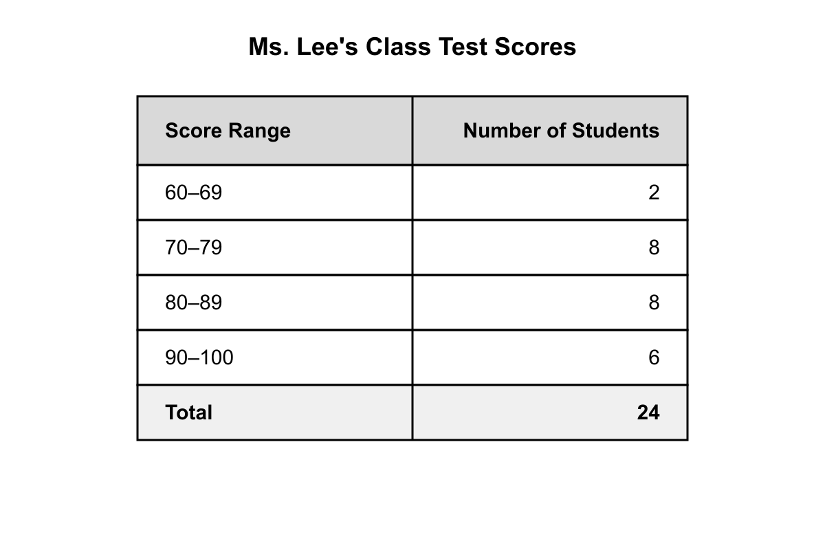
The table above shows the distribution of test scores for Ms. Lee's class. Based on the table shown, if a student is selected at random from those who scored at least 80, what is the probability that the student scored 90 or higher?
- 41
- 31
- 83
- 73 (correct answer)
Explanation: Students who scored at least 80: 80–89 (8 students) + 90–100 (6 students) = 14 students. Students who scored 90 or higher: 6. Conditional probability = 6/14 = 3/7. (A) 1/4 = 6/24 uses total class size as denominator. (B) 1/3 = 8/24 is wrong numerator/denominator. (C) 3/8 = 6/16 incorrectly includes 70–79 range.
Question 2
The circle graph shows how a family's monthly budget of $4,800 is divided. Based on the graph shown, how much more does the family spend on Housing than on Food and Transportation combined?
- $96
- $240 (correct answer)
- $480
- $720
Explanation: Housing = 35% of 4800 = $1,680. Food = 18% of 4800 = $864. Transportation = 12% of 4800 = $576. Food + Transportation = $1,440. Difference = $1,680 − $1,440 = $240. (A) $96 results from computing 2% of 4800 (subtracting percentages 35−18−12=5% but then halving). (C) $480 is 10% of the budget, a common misread of percentages. (D) $720 comes from 35% − 20% = 15%, then 15% of 4800.
Question 3
A family's $5,000 monthly budget is represented by a circle graph. Housing accounts for 30%, Food for 20%, Transportation for 15%, Savings for 10%, and 'Other' for the remainder. How much more money is allocated to Housing and Food combined than to Savings and Transportation combined?
- $250
- $500
- $1,250 (correct answer)
- $2,500
Explanation: First, calculate the total percentage for each category combination. Housing and Food: 30% + 20% = 50%. Savings and Transportation: 10% + 15% = 25%. Next, find the difference in percentages: 50% - 25% = 25%. Finally, calculate the dollar amount of this difference: 25% of $5,000 is 0.25 * 5000 = $1,250.
Question 4
A line graph tracks a city's population. The population was 50,000 in 1980, 60,000 in 1990, 65,000 in 2000, 58,000 in 2010, and 75,000 in 2020. During which ten-year period did the city's population experience the greatest absolute change?
- 1980 to 1990
- 1990 to 2000
- 2000 to 2010
- 2010 to 2020 (correct answer)
Explanation: Calculate the absolute change for each period:
1980-1990: |60,000 - 50,000| = 10,000.
1990-2000: |65,000 - 60,000| = 5,000.
2000-2010: |58,000 - 65,000| = 7,000.
2010-2020: |75,000 - 58,000| = 17,000.
The greatest absolute change was 17,000, which occurred from 2010 to 2020.
Question 5
A box plot summarizing the daily commute times, in minutes, for a group of employees provides the following five-number summary: Minimum = 15, First Quartile (Q1) = 25, Median = 30, Third Quartile (Q3) = 45, Maximum = 90. What is the interquartile range (IQR) of the commute times?
- 15 minutes
- 20 minutes (correct answer)
- 30 minutes
- 75 minutes
Explanation: The interquartile range (IQR) is the difference between the third quartile (Q3) and the first quartile (Q1). In this case, IQR = Q3 - Q1 = 45 - 25 = 20 minutes. The range is 90 - 15 = 75 minutes, and the median is 30 minutes.
Question 6
A chart shows the number of fiction and non-fiction books read last month by four students. Amy read 5 fiction and 10 non-fiction. Ben read 8 fiction and 6 non-fiction. Chloe read 6 fiction and 6 non-fiction. Dan read 3 fiction and 9 non-fiction. Which student read the greatest total number of books?
- Amy (correct answer)
- Ben
- Chloe
- Dan
Explanation: To find the total number of books for each student, add their fiction and non-fiction counts:
Amy: 5 + 10 = 15
Ben: 8 + 6 = 14
Chloe: 6 + 6 = 12
Dan: 3 + 9 = 12
Amy read the greatest total number of books (15).
Question 7
A stem-and-leaf plot displays the ages of attendees at a seminar. The stem '2' has leaves '3, 5, 5, 8'. The stem '3' has leaves '0, 1, 4, 4, 9'. The stem '4' has leaves '2, 6'. What is the median age of the attendees?
- 30
- 30.5
- 31 (correct answer)
- 34
Explanation: First, list the data points in order: 23, 25, 25, 28, 30, 31, 34, 34, 39, 42, 46. There are 11 data points. The median is the middle value, which is the (11 + 1) / 2 = 6th value in the ordered list. The 6th value is 31.
Question 8
A survey of 500 people asked for their primary source of news. A circle graph of the results indicates 35% chose television, 25% chose internet sources, and 20% chose radio. The only other category was print media. How many people chose print media as their primary news source?
- 20
- 80
- 100 (correct answer)
- 400
Explanation: First, sum the given percentages: 35% + 25% + 20% = 80%. The remaining percentage must be for print media: 100% - 80% = 20%. To find the number of people, calculate 20% of the total surveyed: 0.20 * 500 = 100 people.
Question 9
A line graph shows the outdoor temperature at various times. At 12:00 PM, the temperature was 70°F. By 10:00 PM, the temperature had dropped to 50°F. What was the average rate of change in temperature, in degrees Fahrenheit per hour, between 12:00 PM and 10:00 PM?
- An increase of 2 degrees per hour
- A decrease of 2 degrees per hour (correct answer)
- An increase of 2.5 degrees per hour
- A decrease of 2.5 degrees per hour
Explanation: Rate of change is the change in temperature divided by the change in time. The change in temperature is 50°F - 70°F = -20°F. The change in time is from 12:00 PM to 10:00 PM, which is 10 hours. The average rate of change is -20 degrees / 10 hours = -2 degrees per hour, which represents a decrease of 2 degrees per hour.
Question 10
A frequency table shows the number of pets per household in a survey of a neighborhood. The data is as follows: 10 households have 0 pets, 15 have 1 pet, 8 have 2 pets, 5 have 3 pets, and 2 have 4 pets. What is the total number of pets counted in the survey?
- 10
- 40
- 54 (correct answer)
- 60
Explanation: To find the total number of pets, multiply the number of households by the number of pets for each category and sum the results: (10 * 0) + (15 * 1) + (8 * 2) + (5 * 3) + (2 * 4) = 0 + 15 + 16 + 15 + 8 = 54 pets.
Question 11
A stacked bar chart shows a company's revenue sources. In 2022, total revenue was $200,000, of which $50,000 came from services. In 2023, total revenue was $300,000, of which $120,000 came from services. By how many percentage points did the proportion of revenue from services increase from 2022 to 2023?
- 15 percentage points (correct answer)
- 25 percentage points
- 40 percentage points
- 60 percentage points
Explanation: First, calculate the proportion of revenue from services for each year. In 2022: $50,000 / $200,000 = 0.25, or 25%. In 2023: $120,000 / $300,000 = 0.40, or 40%. The increase in percentage points is the difference between these two percentages: 40% - 25% = 15 percentage points.
Question 12
A survey of 100 adults asked about home and car ownership. The results showed that 60 adults own a car, 50 adults own a home, and 20 adults own neither a car nor a home. According to this data, how many of the surveyed adults own both a car and a home?
- 10
- 20
- 30 (correct answer)
- 40
Explanation: Use the principle of inclusion-exclusion: Total = (Group A) + (Group B) - (Both) + (Neither). Here, 100 = 60 (Car) + 50 (Home) - (Both) + 20 (Neither). Simplifying gives 100 = 130 - (Both). Solving for (Both), we find that 30 adults own both a car and a home.
Question 13
A city's annual budget of $12 million is depicted in a circle graph. In the graph, the sector representing the allocation for Public Safety measures 90 degrees. How much money is allocated to Public Safety?
- $2 million
- $3 million (correct answer)
- $4 million
- $6 million
Explanation: A full circle has 360 degrees. The fraction of the budget for Public Safety is the ratio of its sector's angle to the total angle: 90/360 = 1/4. To find the dollar amount, calculate 1/4 of the total budget: (1/4) * $12,000,000 = $3,000,000.
Question 14
A researcher describes the scatterplot of two variables, X and Y, as 'a random cloud of points with no discernible upward or downward trend.' Which of the following correlation coefficients (r) would best describe the relationship shown in the plot?
- r = 0.95
- r = -0.87
- r = 0.03 (correct answer)
- r = -1.00
Explanation: The correlation coefficient (r) measures the strength and direction of a linear relationship. An r-value near +1 or -1 indicates a strong positive or negative linear relationship, respectively. An r-value near 0 indicates little to no linear relationship. A 'random cloud of points' describes a lack of correlation, so an r-value close to 0, like 0.03, is the best fit.
Question 15
A bar chart shows the monthly rainfall for two cities from May to August. For City A, the monthly rainfall amounts were 3, 4, 6, and 5 inches. For City B, the amounts were 5, 5, 4, and 4 inches. Which statement accurately compares the total rainfall and the range of rainfall for the two cities over this period?
- The cities had different total rainfalls but the same range of rainfall.
- The cities had the same total rainfall, but City A had a larger range of rainfall. (correct answer)
- City A had a larger total rainfall and a larger range of rainfall.
- The cities had the same total rainfall and the same range of rainfall.
Explanation: For City A: Total rainfall = 3+4+6+5 = 18 inches. Range = Max - Min = 6 - 3 = 3 inches. For City B: Total rainfall = 5+5+4+4 = 18 inches. Range = Max - Min = 5 - 4 = 1 inch. Both cities had the same total rainfall (18 inches), but City A's range (3 inches) was larger than City B's range (1 inch).
Question 16
A real estate report gives the following data for home prices in two neighborhoods. For Elmwood, the median price is $250,000. For Oakdale, the first quartile (Q1) price is $260,000. Based only on this information, which conclusion must be true?
- The average home price in Oakdale is higher than in Elmwood.
- The most expensive home sold is in Oakdale.
- At least 75% of homes in Oakdale are more expensive than the median-priced home in Elmwood. (correct answer)
- All homes in Oakdale are more expensive than the median-priced home in Elmwood.
Explanation: The first quartile (Q1) is the price below which 25% of the homes fall. This means 75% of homes are priced at or above Q1. Since Oakdale's Q1 is $260,000, at least 75% of its homes cost 260,000ormore.AsElmwood′smedianprice(250,000) is less than $260,000, it must be less expensive than at least 75% of the homes in Oakdale. Question 17
A pie chart shows the distribution of a company's 50 employees across four departments: Sales (40%), Marketing (30%), Tech (20%), and Admin (10%). Based on this chart, which of the following statements is a valid conclusion?
- The Sales department is the most important department in the company.
- The average salary in the Marketing department is higher than in the Admin department.
- Next year, the percentage of employees in the Tech department is expected to increase.
- The Sales department has exactly 20 employees. (correct answer)
Explanation: A pie chart shows proportions at a single point in time. We can only make direct calculations based on the data given. The number of employees in Sales is 40% of 50, which is 0.40 * 50 = 20. The other statements infer value (importance), other data (salary), or future trends, none of which can be concluded from the chart.
Question 18
The scores of 25 students on a 10-point quiz are summarized in a frequency table. The data show that 3 students scored 6, 5 students scored 7, 10 students scored 8, 4 students scored 9, and 3 students scored 10. What was the median score?
- 7
- 7.5
- 8 (correct answer)
- 8.2
Explanation: There are 25 students in total. The median is the score of the middle student, which is the (25 + 1) / 2 = 13th student when scores are listed in order. The first 3 students scored 6. The next 5 students (up to the 8th student) scored 7. The next 10 students (from the 9th to the 18th student) scored 8. Since the 13th student falls into this group, the median score is 8.
Question 19
A line graph showing a company's annual profits from 2020 to 2023 displays the following data points: 2020 (10million),2021(10.5 million), 2022 (11.2million),and2023(12 million). The vertical axis of the graph is labeled starting at $10 million instead of $0. Which statement best describes a potential consequence of this choice of scale?
- The graph will make the profit growth appear more dramatic than it actually is. (correct answer)
- The graph will incorrectly suggest that the company made no profit before 2020.
- The graph will make it impossible to determine the actual profit for any given year.
- The graph will visually flatten the trend line, making profit growth seem insignificant.
Explanation: Using a truncated axis (one that doesn't start at zero) can be misleading. By showing only the top portion of the values, the visual distance between the points is exaggerated relative to their actual values. This makes the increases seem much larger and more significant than they would on a graph starting at zero.
Question 20
A table shows the relative frequencies of letter grades in a class of 400 students. The relative frequency for an A is 0.15, for a B is 0.35, and for a C is 0.30. The only other grades possible were D and F, which were earned by an equal number of students. How many students earned a grade of D?
- 10
- 20
- 40 (correct answer)
- 80
Explanation: First, find the total relative frequency for grades A, B, and C: 0.15 + 0.35 + 0.30 = 0.80. The remaining relative frequency for D and F combined is 1.00 - 0.80 = 0.20. Since D and F have equal frequencies, the relative frequency for D is 0.20 / 2 = 0.10. The number of students who earned a D is 0.10 * 400 = 40.