All questions
Question 1
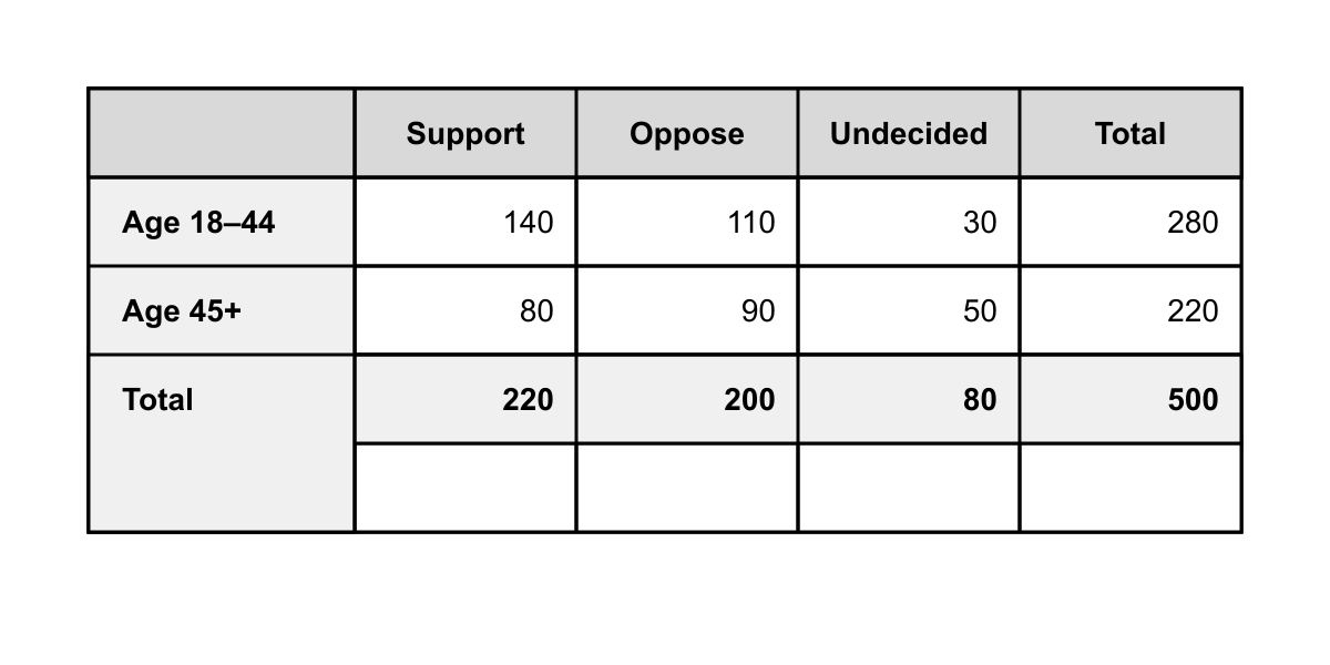
The two-way table shown summarizes survey responses from 500 adults asked whether they support a proposed transit tax. Among respondents who said 'Undecided,' what fraction are age 45 or older?
- 8030
- 8050 (correct answer)
- 22050
- 50080
Explanation: Undecided total: 30 (18–44) + 50 (45+) = 80. Age 45+ undecided: 50. Fraction = 50/80. (A) uses the 18–44 undecided numerator. (C) divides 45+ undecided by total 45+ respondents (wrong conditional). (D) divides total undecided by grand total.
Question 2
Based on the scatter plot and its line of best fit shown below, what is the predicted number of magazine subscriptions (in thousands) in the year 2025?
- 60
- 63
- 72.5 (correct answer)
- 75
Explanation: The best-fit line is labeled y=2.5x+10, where x is years after 2000. For 2025, x=25 so y=2.5(25)+10=72.5 thousand.
A and B underestimate by using x=20 or rounding.
D uses x=26 or rounds up indiscriminately. Question 3
Refer to the dot plot shown, which displays the number of pets owned by 20 families surveyed in a neighborhood. If the family with the highest number of pets is removed from the data, how does the mean change?
- The mean decreases by approximately 0.32. (correct answer)
- The mean decreases by approximately 0.42.
- The mean decreases by approximately 0.50.
- The mean stays the same.
Explanation: Original sum: (0)(3) + (1)(5) + (2)(6) + (3)(3) + (4)(2) + (8)(1) = 0+5+12+9+8+8 = 42. Mean = 42/20 = 2.10. Remove the 8: new sum = 34, 19 values. New mean = 34/19 ≈ 1.789. Decrease ≈ 2.10 − 1.79 = 0.31, ≈ 0.32. (B) miscounts data. (C) divides by 20 again. (D) ignores the outlier effect.
Question 4
The graph shown plots y=f(x) for −4≤x≤5. For how many integer values of k in the interval −3≤k≤3 does the equation f(x)=k have exactly two solutions?
- 2
- 3 (correct answer)
- 4
- 5
Explanation: Using horizontal line y=k: k = −3: 1 intersection; k = −2: 2 intersections; k = −1: 3 intersections; k = 0: 2 intersections; k = 1: 3 intersections; k = 2: 2 intersections; k = 3: 1 intersection. Values with exactly two solutions: k = −2, 0, 2 → three values. Question 5
The scatterplot shown displays the relationship between the number of hours x that 12 students studied for an exam and their exam scores y. The line of best fit for the data is y=4.2x+58. Based on the scatterplot and the line of best fit, which of the following statements is true?
- The student who studied for 6 hours scored higher than the line of best fit predicts.
- For every additional hour studied, a student's actual exam score increased by exactly 4.2 points.
- The predicted score for a student who studied 0 hours is greater than the actual score of any student in the data set.
- The residual for the student who studied 10 hours is approximately 8 points. (correct answer)
Explanation: The student who studied 10 hours scored 108 on the graph. The predicted score is 4.2(10)+58=100. The residual is 108−100=8. (A) is false because the 6-hour student scored 78, below the predicted 4.2(6)+58=83.2. (B) misinterprets slope — the slope describes predicted change, not actual change for each individual. (C) is false because several plotted scores exceed 58. Question 6
The graph shown displays the function y=g(x). The function h is defined by h(x)=g(x−2)+3. What is the value of h(4)?
- −1
- 2
- 5 (correct answer)
- 7
Explanation: h(4)=g(4−2)+3=g(2)+3. From the graph, g(2)=2. So h(4)=2+3=5. (A) computes g(4)−3. (B) forgets the +3 shift. (D) computes g(2+2)+3=g(4)+3=4+3. Question 7
The bar graph shown gives the number of books read by students in four book clubs (A, B, C, and D) during two months, March and April. In which book club did the percent increase in books read from March to April exceed 50%?
- Club A
- Club B
- Club C (correct answer)
- Club D
Explanation: Compute percent change: Club A: (36−30)/30=20%. Club B: (45−36)/36=25%. Club C: (33−20)/20=65%. Club D: (60−42)/42≈42.9%. Only Club C exceeds 50%. Students who compute absolute differences (Club D has largest absolute gain of 18) would incorrectly choose D. Question 8
Based on the cumulative frequency graph, what percent of the 40 plants are taller than 50 cm?
- 20%
- 30% (correct answer)
- 35%
- 40%
Explanation: At 50 cm the graph shows 28 plants or 70 % at or below that height. Plants taller than 50 cm: 40−28=12, which is 12/40=30%.
Other choices misread the cumulative counts. Question 9
Refer to the graph. Between 8 a.m. and 2 p.m., what was the average rate of change of the temperature, in degrees Fahrenheit per hour?
- 0.75
- 1.2
- 1.5 (correct answer)
- 3.0
Explanation: At 8 a.m. the graph shows 61∘F, and at 2 p.m. (14:00) it shows 70∘F. The change is 70−61=9∘F over 14−8=6 hours, giving 9/6=1.5∘F per hour.
A: 0.75 misuses the total 12-hour span.
B: 1.2 divides the 6-hour change by 7.5 hours in error.
D: 3.0 confuses the change with the rate for a 3-hour interval. Question 10
Use the distance–time graph. During which time interval was the runner at rest?
- 0–2 minutes
- 2–6 minutes (correct answer)
- 6–8 minutes
- 8–10 minutes
Explanation: The graph is horizontal from 2 to 6 minutes, showing no increase in distance. A, C, and D correspond to positive-slope segments indicating motion.
Question 11
Refer to the stacked bar chart. Which energy source experienced the greatest change in its percentage share of electricity generation from 2010 to 2020?
- Coal (correct answer)
- Natural gas
- Renewable
- Nuclear
Explanation: Coal drops from 45 % to 25 %, a 20-percentage-point change. Renewable rises 15 → 30 (15 points), natural gas 30 → 35 (5), nuclear stays at 10 (0). The largest change is coal. Others change less.
Question 12
Use the bar graph to answer the question. Approximately what percent of the students going on the field trip are seniors (Grade 12)?
- 12%
- 19% (correct answer)
- 25%
- 32%
Explanation: Total students 48+56+38+34=176. Seniors: 34/176≈0.193=19%.
A: 12 % uses 22 seniors.
C: 25 % rounds 34/136.
D: 32 % treats 56 seniors instead of 34. Question 13
Refer to the histogram below. If one student is chosen at random, what is the probability that the student scored at least 80 on the test?
- 61
- 31
- 21 (correct answer)
- 32
Explanation: Bars for 80–89 and 90–99 contain 9+6=15 students. Total students: 2+5+8+9+6=30. Probability =15/30=1/2.
A and B undervalue by using only one bar.
D assumes 20 students scored 80 or higher. Question 14
Use the box-and-whisker plot below. About what percent of the students studied between 6 and 12 hours inclusive during the week?
- 25%
- 50% (correct answer)
- 75%
- Cannot be determined
Explanation: The interval from the first quartile (6 h) to the third quartile (12 h) contains the middle 50 % of the data.
A and C confuse quartile spacing.
D ignores the definition of a box plot.
Question 15
Use the table shown to answer the question. A survey asked 400 high school students about their primary mode of transportation to school and their grade level. If one junior or senior is selected at random from the survey respondents, what is the probability that the student's primary mode of transportation is driving?
- 20085
- 40085
- 400125
- 200125 (correct answer)
Explanation: Juniors + Seniors total 100 + 100 = 200. Drivers among juniors/seniors: 40 + 85 = 125. Probability = 125/200. (A) uses only seniors numerator with juniors+seniors denominator. (B) uses seniors who drive over entire sample. (C) uses all drivers over entire sample, ignoring the 'junior or senior' condition.
Question 16
The table shown lists the enrollment at a community college for five consecutive years. Which of the following statements best describes the data?
- Enrollment increased by approximately the same percentage each year. (correct answer)
- Enrollment increased by approximately the same number of students each year.
- Enrollment growth slowed each year, approaching a constant total.
- Enrollment grew exponentially and then declined.
Explanation: Ratios year-to-year: 2640/2400 = 1.10, 2904/2640 = 1.10, 3194/2904 ≈ 1.10, 3514/3194 ≈ 1.10. Each ratio is about 1.10, indicating roughly 10% growth per year — not constant absolute increase (differences are 240, 264, 290, 320, increasing). (B) matches a linear pattern, not this data. (C) contradicts the accelerating absolute growth. (D) has no decline.
Question 17
The circle graph shown represents how a city's $8,000,000 budget is allocated among six categories. If the city decides to increase the education allocation by 25% by taking funds proportionally from only the 'Parks' and 'Other' categories, and the ratio of amounts taken from Parks to Other is 3:1, how much will be taken from the Parks category?
- $150,000
- $300,000
- $450,000 (correct answer)
- $600,000
Explanation: Education = 30% of 8{,}000{,}000 = \2{,}400{,}000.Increaseof25$600{,}000.Split3:1betweenParksandOthermeansParkscontributes\frac{3}{4}(600{,}000) = $450{,}000$. (A) takes 25% of Parks alone. (B) splits evenly. (D) takes entire increase from Parks. Question 18
The scatterplot shown displays the relationship between x and y for 8 data points, with line of best fit drawn. A ninth data point, (10, 20), is added to the data set. Which of the following best describes the effect on the slope of the line of best fit?
- The slope will increase substantially because (10, 20) lies far above the current line.
- The slope will decrease because (10, 20) lies below the predicted y-value for x = 10. (correct answer)
- The slope will remain essentially unchanged because the point lies near the line of best fit.
- The slope will decrease because the point has the largest x-value in the data set.
Explanation: From the graph, the line of best fit is approximately y=2.5x+3, so at x=10, the predicted y is 28. The new point (10, 20) lies 8 units below the line. Since this point is at the far-right (high x), it exerts strong leverage, pulling the right end of the regression line down, which decreases the slope. (A) incorrectly claims the point is above the line. (C) incorrect — far-right low point has high leverage. (D) misattributes the cause to x-position alone; the y-value matters. Question 19
Refer to the double-line graph shown, which displays monthly revenue (in thousands of dollars) for Store A and Store B from January through June. During which month was the percent difference between the stores' revenues the greatest (relative to the smaller value)?
- February
- March (correct answer)
- April
- May
Explanation: Percent difference = |A−B|/min(A,B). Feb: |30−20|/20 = 50%. Mar: |40−15|/15 ≈ 167%. Apr: |25−45|/25 = 80%. May: |50−30|/30 ≈ 67%. Greatest is March. (A), (C), (D) correspond to months with large absolute differences but smaller percent differences relative to the smaller value.
Question 20
The histogram shown displays the distribution of test scores for 50 students. Which of the following must be true about the median score?
- The median is in the interval 60≤x<70.
- The median is in the interval 70≤x<80. (correct answer)
- The median is in the interval 80≤x<90.
- The median cannot be determined from the histogram.
Explanation: Cumulative counts: 50–60: 4; 60–70: 4+10 = 14; 70–80: 14+18 = 32; 80–90: 32+12 = 44; 90–100: 44+6 = 50. The median is the average of the 25th and 26th values. Both fall in 70–80 since cumulative count reaches 14 before and 32 through this interval. (A) gives only 14 values. (C) forgets to count earlier intervals. (D) is incorrect — the interval can be determined.