Representing Data - Algebra 2
Card 1 of 112
Which of the following represents a positive association in a scatterplot?
Which of the following represents a positive association in a scatterplot?
Tap to reveal answer
A positive association is defined as a scatterplot on which the best fit line has a positive slope.
This pattern is identified because on the graph, looking from left to right, the vast majority of the points goes up.
This can also be described by saying, "as  increases,
  increases".
A positive association is defined as a scatterplot on which the best fit line has a positive slope.
This pattern is identified because on the graph, looking from left to right, the vast majority of the points goes up.
This can also be described by saying, "as
← Didn't Know|Knew It →
A scatterplot correlates adult males' height vs. shoe size. What does the point ") on the scatterplot represent?
on the scatterplot represent?
A scatterplot correlates adult males' height vs. shoe size. What does the point
Tap to reveal answer
When creating a scatterplot, data is collected. This data is formulated into ordered pairs. Each of these ordered pairs, which are later graphed, represent one person's data. Thus, this particular piece of data would represent one man's height of  inches and that same man's shoe size of
  .
.
When creating a scatterplot, data is collected. This data is formulated into ordered pairs. Each of these ordered pairs, which are later graphed, represent one person's data. Thus, this particular piece of data would represent one man's height of
← Didn't Know|Knew It →
Which of the following would most likely represent an outlier on a scatterplot which relates height (in inches) to shoe size for men?
Which of the following would most likely represent an outlier on a scatterplot which relates height (in inches) to shoe size for men?
Tap to reveal answer
An outlier is defined as a point that does not fit within the general pattern of the data. Thus, we are looking for a height that is not within the normal range for an adult male, and shoe size which is outside of the range for an adult male. Typically, an adult male would be between 65 and 77 inches tall (5 feet 5 inches and 6 feet 5 inches). Typically, an adult male's shoe size would be around a 10. Thus, the outlier would have height and shoe size drastically different from these, ") .
.
An outlier is defined as a point that does not fit within the general pattern of the data. Thus, we are looking for a height that is not within the normal range for an adult male, and shoe size which is outside of the range for an adult male. Typically, an adult male would be between 65 and 77 inches tall (5 feet 5 inches and 6 feet 5 inches). Typically, an adult male's shoe size would be around a 10. Thus, the outlier would have height and shoe size drastically different from these,
← Didn't Know|Knew It →
What type of correlation does this data have?
What type of correlation does this data have?
Tap to reveal answer
It has a positive correlation because the points all trend upward. In other words, as the independent variable on the x-axis increases, the dependent variable on the y-axis also increases. Therefore, the line of best fit that is drawn through the data represents a positive line as it has a positive slope. This verifies that our data has a positive correlation.
It has a positive correlation because the points all trend upward. In other words, as the independent variable on the x-axis increases, the dependent variable on the y-axis also increases. Therefore, the line of best fit that is drawn through the data represents a positive line as it has a positive slope. This verifies that our data has a positive correlation.
← Didn't Know|Knew It →
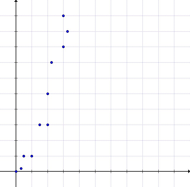
This scatter plot represents data about snack quality ( -axis) vs. price (
 -axis). Which statements are a correct interpretation of the data?
I. The price of a higher quality snack tends to be higher.
II. Points below the line represent snacks whose price is higher than their quality.
III. Points above the line represent snacks whose quality is higher than their price.
This scatter plot represents data about snack quality (
I. The price of a higher quality snack tends to be higher.
II. Points below the line represent snacks whose price is higher than their quality.
III. Points above the line represent snacks whose quality is higher than their price.
Tap to reveal answer
I. is a true statement about the scatter plot: as quality increases, price tends to increase.
II. is not true - the points under the line have a relatively low price compared to their quality.
III. is also not true - the points above the line have relatively low quality compared to their price.
I. is a true statement about the scatter plot: as quality increases, price tends to increase.
II. is not true - the points under the line have a relatively low price compared to their quality.
III. is also not true - the points above the line have relatively low quality compared to their price.
← Didn't Know|Knew It →
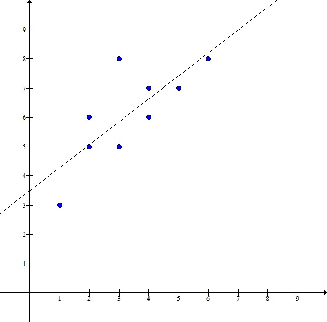
What would be the most accurate line of best fit for this scatter plot?
What would be the most accurate line of best fit for this scatter plot?
Tap to reveal answer
This data is quadratic rather than linear - it increases much more sharply than the line  . It is also a positive correlation, so the equation should be positive. It is not
  because the data starts very near the origin
 ") .
.
This data is quadratic rather than linear - it increases much more sharply than the line
← Didn't Know|Knew It →

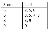
Above is a stem-and-leaf representation of the scores on a test administered to a group of students. What was the mode of the scores?
Above is a stem-and-leaf representation of the scores on a test administered to a group of students. What was the mode of the scores?
Tap to reveal answer
The mode of the data set is the score that occurs the most frequently.
Each "stem" in the left column represents the tens digits of the scores; each of the numbers in its row, or "leaf" represents the units digits. The entry that occurs the most frequently is represented by the "6" in the "7" row, so 76 is the one and only mode.
← Didn't Know|Knew It →
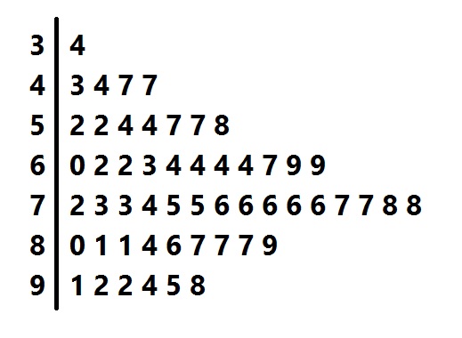
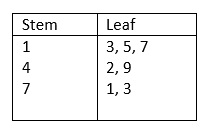
Above is a stem-and-leaf plot for the test scores administered to a group of students.
What was the median score?
Above is a stem-and-leaf plot for the test scores administered to a group of students.
What was the median score?
Tap to reveal answer
Each of the numbers in the leftmost column, or "stems" represents the tens digits of one or more scores; each digit in one of the rows, or "leaf", represents the units digit of a score.
The median score is the score that occurs in the middle when the scores are arranged from least to greatest, which there are, so we count up until we get to the middle score. There are 53, so we look for the
 highest (or lowest) score. Counting up 27 scores, we get to the "4" in the "7" row, which represents a score of 74. This is the median.
Each of the numbers in the leftmost column, or "stems" represents the tens digits of one or more scores; each digit in one of the rows, or "leaf", represents the units digit of a score.
The median score is the score that occurs in the middle when the scores are arranged from least to greatest, which there are, so we count up until we get to the middle score. There are 53, so we look for the
← Didn't Know|Knew It →
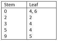
List the data values for the given Stem and Leaf plot.
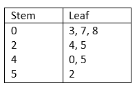
List the data values for the given Stem and Leaf plot.
Tap to reveal answer
The tens-digits are in the Stem column (left-side) while the ones-digits are in the Leaf column (right-side). Therefore, the data in the Stem and Leaf plot can be written as:

The tens-digits are in the Stem column (left-side) while the ones-digits are in the Leaf column (right-side). Therefore, the data in the Stem and Leaf plot can be written as:
← Didn't Know|Knew It →
List the data values for the given Stem and Leaf plot.
List the data values for the given Stem and Leaf plot.
Tap to reveal answer
The tens-digits are placed in the Stem column (left-side) and the ones-digits are placed in the Leaf column. Therefore, the data in the Stem and Leaf plot can be written as:

The tens-digits are placed in the Stem column (left-side) and the ones-digits are placed in the Leaf column. Therefore, the data in the Stem and Leaf plot can be written as:
← Didn't Know|Knew It →
Create the Stem and Leaf plot for the given data values.

Create the Stem and Leaf plot for the given data values.
Tap to reveal answer
The tens-digits are placed in the Stem column (left-side) and the ones-digits are placed in the Leaf column.
The list of values is:
34, 54, 6, 95, 22, 4
This data can also be written as 04, 06, 22, 34, 54, 95
The tens-digits are placed in the Stem column (left-side) and the ones-digits are placed in the Leaf column.
The list of values is:
34, 54, 6, 95, 22, 4
This data can also be written as 04, 06, 22, 34, 54, 95
← Didn't Know|Knew It →
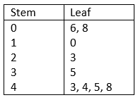
Create the Stem and Leaf plot for the given data values:
6, 8, 10, 23, 35, 43, 44, 45, 48
Create the Stem and Leaf plot for the given data values:
6, 8, 10, 23, 35, 43, 44, 45, 48
Tap to reveal answer
The tens-digits are placed in the Stem column (left-side) and the ones-digits are placed in the Leaf column.
The data values are:
6, 8, 10, 23, 35, 43, 44, 45, 48
We can rewrite it as follow
06, 08, 10, 23, 35, 43, 44, 45, 48
The tens-digits are placed in the Stem column (left-side) and the ones-digits are placed in the Leaf column.
The data values are:
6, 8, 10, 23, 35, 43, 44, 45, 48
We can rewrite it as follow
06, 08, 10, 23, 35, 43, 44, 45, 48
← Didn't Know|Knew It →

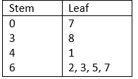
Which of the following represents the correct median value of the above Stem and Leaf Plot?
Which of the following represents the correct median value of the above Stem and Leaf Plot?
Tap to reveal answer
There are 18 data points in this set, so the median lies halfway between the 9th and 10th sequential data point:
9th Point: 
10th Point: 
And:

The correct median value of the data set is 74
There are 18 data points in this set, so the median lies halfway between the 9th and 10th sequential data point:
9th Point:
10th Point:
And:
The correct median value of the data set is 74
← Didn't Know|Knew It →
Draw a Box and Whisker plot for the following data set.

Draw a Box and Whisker plot for the following data set.
Tap to reveal answer
Put the data in numerical order (from smallest to largest) if it isn't already. In order to find the median, divide the data into two halves. In order to divide the values into quartiles, find the median of the two halves.

1st quartile:  ,
,  ,
, 
Median of 1st quartile: 
2nd quartile = Median of total set: 
3rd quartile:  ,
,  ,
, 
Median of 3rd quartile: 
To construct the Box and Whisker Plot we use the minimum and the maximum value in the data set as the ends of the whiskers. To construct the box, we plot a line at the median of the 1st quartile, the median of our total data set, and at the median of the 3rd quartile. Then we connect the tops and bottom of the lines. The result is as follows:
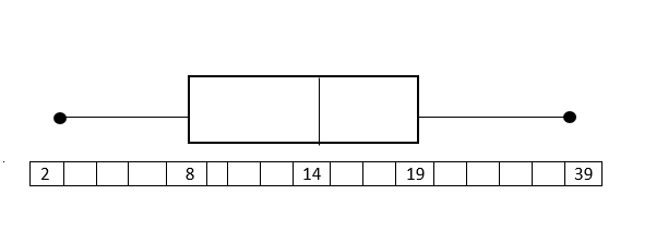
The endpoints (black dots) represent the smallest and largest values, in this case, 2 and 39.
Put the data in numerical order (from smallest to largest) if it isn't already. In order to find the median, divide the data into two halves. In order to divide the values into quartiles, find the median of the two halves.
1st quartile:
Median of 1st quartile:
2nd quartile = Median of total set:
3rd quartile:
Median of 3rd quartile:
To construct the Box and Whisker Plot we use the minimum and the maximum value in the data set as the ends of the whiskers. To construct the box, we plot a line at the median of the 1st quartile, the median of our total data set, and at the median of the 3rd quartile. Then we connect the tops and bottom of the lines. The result is as follows:
The endpoints (black dots) represent the smallest and largest values, in this case, 2 and 39.
← Didn't Know|Knew It →
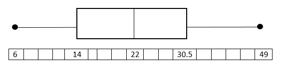
Draw a Box and Whisker plot for the following data set.

Draw a Box and Whisker plot for the following data set.
Tap to reveal answer
Put the data in numerical order (from smallest to largest) if it isn't already. In order to find the median, divide the data into two halves. In order to divide the values into quartiles, find the median of the two halves.
1st quartile: 
Median of 1st quartile: 
2nd quartile = Median: 
3rd quartile:
Median of 3rd quartile: 
To construct the Box and Whisker Plot we use the minimum and the maximum value in the data set as the ends of the whiskers. To construct the box, we plot a line at the median of the 1st quartile, the median of our total data set, and at the median of the 3rd quartile. Then we connect the tops and bottom of the lines. The result is as follows:
Put the data in numerical order (from smallest to largest) if it isn't already. In order to find the median, divide the data into two halves. In order to divide the values into quartiles, find the median of the two halves.
1st quartile:
Median of 1st quartile:
2nd quartile = Median:
3rd quartile:
Median of 3rd quartile:
To construct the Box and Whisker Plot we use the minimum and the maximum value in the data set as the ends of the whiskers. To construct the box, we plot a line at the median of the 1st quartile, the median of our total data set, and at the median of the 3rd quartile. Then we connect the tops and bottom of the lines. The result is as follows:
← Didn't Know|Knew It →
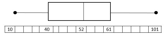
Draw a box and whisker plot for the following data set.

Draw a box and whisker plot for the following data set.
Tap to reveal answer
Put the data in numerical order (from smallest to largest) if it isn't already. In order to find the median, divide the data into two halves. In order to divide the values into quartiles, find the median of the two halves.
1st quartile: 
Median of 1st quartile: 
2nd quartile = Median: 
3rd quartile: 
Median of 3rd quartile: 
To construct the Box and Whisker Plot we use the minimum and the maximum value in the data set as the ends of the whiskers. To construct the box, we plot a line at the median of the 1st quartile, the median of our total data set, and at the median of the 3rd quartile. Then we connect the tops and bottom of the lines. The result is as follows:
Put the data in numerical order (from smallest to largest) if it isn't already. In order to find the median, divide the data into two halves. In order to divide the values into quartiles, find the median of the two halves.
1st quartile:
Median of 1st quartile:
2nd quartile = Median:
3rd quartile:
Median of 3rd quartile:
To construct the Box and Whisker Plot we use the minimum and the maximum value in the data set as the ends of the whiskers. To construct the box, we plot a line at the median of the 1st quartile, the median of our total data set, and at the median of the 3rd quartile. Then we connect the tops and bottom of the lines. The result is as follows:
← Didn't Know|Knew It →
Draw a Box and Whisker plot for the following data set.

Draw a Box and Whisker plot for the following data set.
Tap to reveal answer
Put the data in numerical order (from smallest to largest) if it isn't already. In order to find the median, divide the data into two halves. In order to divide the values into quartiles, find the median of the two halves.
1st quartile: 
Median of 1st quartile: 
2nd quartile= Median: 
3rd quartile: 
Median of 3rd quartile: 
To construct the Box and Whisker Plot we use the minimum and the maximum value in the data set as the ends of the whiskers. To construct the box, we plot a line at the median of the 1st quartile, the median of our total data set, and at the median of the 3rd quartile. Then we connect the tops and bottom of the lines.
Put the data in numerical order (from smallest to largest) if it isn't already. In order to find the median, divide the data into two halves. In order to divide the values into quartiles, find the median of the two halves.
1st quartile:
Median of 1st quartile:
2nd quartile= Median:
3rd quartile:
Median of 3rd quartile:
To construct the Box and Whisker Plot we use the minimum and the maximum value in the data set as the ends of the whiskers. To construct the box, we plot a line at the median of the 1st quartile, the median of our total data set, and at the median of the 3rd quartile. Then we connect the tops and bottom of the lines.
← Didn't Know|Knew It →
Draw a Box and Whisker plot for the following data set.

Draw a Box and Whisker plot for the following data set.
Tap to reveal answer
Put the data in numerical order (from smallest to largest) if it isn't already. In order to find the median, divide the data into two halves. In order to divide the values into quartiles, find the median of the two halves.
1st quartile: 
Median of 1st quartile: 
2nd quartile = Median: 
3rd quartile: 
Median of 3rd quartile: 
To construct the Box and Whisker Plot we use the minimum and the maximum value in the data set as the ends of the whiskers. To construct the box, we plot a line at the median of the 1st quartile, the median of our total data set, and at the median of the 3rd quartile. Then we connect the tops and bottom of the lines. The result is as follows:
Put the data in numerical order (from smallest to largest) if it isn't already. In order to find the median, divide the data into two halves. In order to divide the values into quartiles, find the median of the two halves.
1st quartile:
Median of 1st quartile:
2nd quartile = Median:
3rd quartile:
Median of 3rd quartile:
To construct the Box and Whisker Plot we use the minimum and the maximum value in the data set as the ends of the whiskers. To construct the box, we plot a line at the median of the 1st quartile, the median of our total data set, and at the median of the 3rd quartile. Then we connect the tops and bottom of the lines. The result is as follows:
← Didn't Know|Knew It →