Study Evidence In Tables And Graphs in PSAT Reading and Writing with focused flashcards that help you recognize the idea, recall the key rule, and apply it in practice-style prompts.
All flashcards
Flashcard 1: What does it mean when a table reports the mean of a data set?
Answer: Arithmetic average: sum of values divided by number of values. Add all values and divide by how many there are.
Flashcard 2: Find the percent change from 50 to 60 (nearest whole percent).
Answer: 20%. 5060−50×100%=5010×100%=20%
Flashcard 3: What is the difference between correlation and causation in graph-based claims?
Answer: Correlation is association; causation is one variable producing change in another. Association doesn't prove one causes the other.
Flashcard 4: Find the percent increase: A value rises from 40 to 50. What is the percent change?
Answer: 25% increase. Apply formula: 4050−40×100%=25%.
Flashcard 5: Identify the supported claim: A line graph rises from 10 to 25 between 2010 and 2020. What happened?
Answer: The value increased by 15 from 2010 to 2020. Calculate 25−10=15 to find the increase.
Flashcard 6: What does it mean if an axis uses a truncated scale that does not start at 0?
Answer: Visual differences may be exaggerated compared with a zero-based axis. Small differences appear larger when the baseline isn't zero.
Flashcard 7: Choose the supported inference: A chart shows Group A =30% and Group B =20%. What is true?
Answer: Group A is 10 percentage points higher than Group B. Subtract percentages: 30%−20%=10 percentage points.
Flashcard 8: What is the first step when a question asks you to support a claim using a table or graph?
Answer: Identify the relevant variables, units, and time or categories. Start by understanding what data the visual presents before evaluating claims.
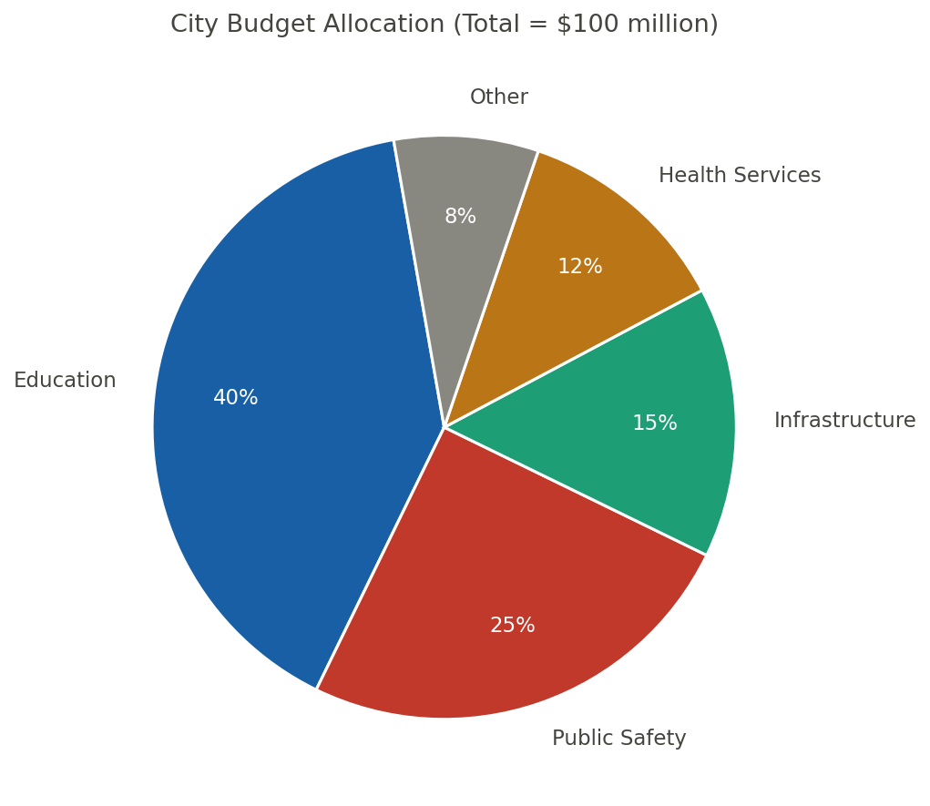
Flashcard 9: A pie chart shows 25% of 80 respondents chose option C. How many respondents chose C?
Answer: 20. 25% of 80=0.25×80=20 respondents.
Flashcard 10: Compute the rate: A graph shows y goes from 8 to 20 as x goes from 2 to 5. What is the slope?
Answer: 4. Slope = 5−220−8=312=4.
Flashcard 11: A table shows A=12 and B=9. What is the difference A−B?
Answer: 3. Subtract the smaller value from the larger: 12−9=3.
Flashcard 12: What must you check first to avoid misreading values on a graph's vertical axis?
Answer: The axis scale and units (including whether it starts at 0). Misreading scales is a common source of errors.
Flashcard 13: What is the key first step to interpret a table or graph question accurately?
Answer: Read the title, labels, units, and legend. Context clues in titles and labels prevent misinterpretation.
Flashcard 14: What is the percent change from an old value to a new value?
Answer: oldnew−old×100%. Measures relative change as a percentage of the original value.
Flashcard 15: A table shows Group A: 12 and Group B: 18. What is the difference B−A?
Answer: 6. Simple subtraction: 18−12=6
Flashcard 16: A chart shows total 200 and subgroup 50. What percent of the total is the subgroup?
Answer: 25%. 20050×100%=0.25×100%=25%
Flashcard 17: A table shows A=50 in 2020 and A=65 in 2021. What is the percent increase?
Answer: 30%. 5065−50×100%=5015×100%=30%.
Flashcard 18: A pie chart shows Segment A is 40%. What fraction of the whole is Segment A?
Answer: 52. 40%=10040=52
Flashcard 19: Identify the value at year 2022 if the line graph shows points (2021,50) and (2022,60).
Answer:
- Read the y-value at the given x-coordinate on the graph.
Flashcard 20: Which option is correct if a bar graph's y-axis is "thousands of dollars" and the bar is at 7?
Answer: \7{,}000.Multiplythescalevaluebytheunit:7 \times 1000 = 7000$.
Flashcard 21: Find the mean of the data values 4, 6, and 8 shown in a row of a table.
Answer: 6. 34+6+8=318=6.
Flashcard 22: Identify the correct average: Values are 10, 14, and 16. What is the mean?
Answer: 340. 310+14+16=340
Flashcard 23: A graph shows a value of 50 at x=2 and 45 at x=3. Which statement matches the change?
Answer: It decreased by 5 from x=2 to x=3. 45−50=−5, showing a decrease of 5 units.
Flashcard 24: What is the first step when a question asks you to use evidence from a table or graph?
Answer: Identify the specific claim to test, then locate the relevant data. Always pinpoint what you're proving before searching for evidence.
Flashcard 25: Identify the absolute change from 120 units in 2019 to 95 units in 2020.
Answer: −25 units. 95−120=−25 shows a decrease of 25 units.
Flashcard 26: What is the best evidence if a question asks for an exception to a general upward trend?
Answer: The interval where the value decreases or stays flat against the trend. Find where the line dips or plateaus against overall rise.
Flashcard 27: What is the median of an ordered data set with an even number of values?
Answer: Average of the two middle values. For even counts, median lies between the two center values.
Flashcard 28: Find the percent change from 40 to 50.
Answer: 25%. 4050−40×100%=4010×100%=25%
Flashcard 29: Compute the percent decrease: a value in a table changes from 80 to 60. What is the percent change?
Answer: −25%. 8060−80×100%=80−20×100%=−25%
Flashcard 30: Choose the correct interpretation: A bar chart shows 30% for category X. Out of 200 total, how many are X?
Answer: 60. 30%×200=0.30×200
Flashcard 31: What is an outlier in a scatterplot?
Answer: A point far from the overall pattern or trend of the other points. Outliers deviate significantly from the general data pattern.
Flashcard 32: What does "per capita" mean when interpreting a graph or table?
Answer: Per person; the total divided by population. Divides a total by the number of people to show individual share.
Flashcard 33: What is the slope (rate of change) formula between two points on a line graph?
Answer: m=x2−x1y2−y1. Rise over run calculates rate of change between points.
Flashcard 34: What is the correct interpretation of a pie chart slice labeled 25%?
Answer: That category represents \frac{1}{4} of the total. 25% equals one-fourth of the whole circle.
Flashcard 35: Find the correct interpretation: A line graph shows a flat segment from day 3 to day 5. What happened then?
Answer: The value stayed constant from day 3 to day 5. A horizontal line indicates no change.
Flashcard 36: What does it mean when a table reports the median of a data set?
Answer: The middle value when ordered; average of two middle if even count. Half the values are above and half below this point.
Flashcard 37: What is the best evidence choice when a question asks for the strongest support from data?
Answer: The option that cites the most direct, specific matching values. Precise data that exactly matches the claim provides strongest proof.
Flashcard 38: What does an outlier in a data set shown on a graph most directly indicate?
Answer: A value far from the overall pattern or trend. Outliers deviate significantly from the main trend.
Flashcard 39: What is the correct way to report a value read from a graph when the axis shows units?
Answer: State the number with its unit (and context, such as year or category). Include units and context to make data values meaningful and complete.
Flashcard 40: Identify the strongest support: A claim says "Most respondents chose option C." What table evidence best supports it?
Answer: Option C has the highest frequency/percentage in the table. "Most" means more than half chose that option.
Flashcard 41: What does it mean to cite evidence from a table or graph accurately?
Answer: Use the correct category, unit, and value shown in the data. Match the exact data point to its label and measurement.
Flashcard 42: Identify the best evidence: A claim says "sales peaked in June." Which table entry supports it if June is the maximum?
Answer: The June value is the largest number in the sales column. Peak means highest value in the data set.
Flashcard 43: Which option best defines correlation in a scatterplot: causation, association, or randomness?
Answer: Association between two variables. Correlation shows how two variables move together, not cause-effect.
Flashcard 44: What is the key caution when a passage claims one variable causes another using a graph?
Answer: Do not infer causation from correlation alone. Correlation doesn't prove one variable causes the other.
Flashcard 45: Identify the value: If total is 200 and a category is 30, what percent is the category?
Answer: 15%. 20030×100%=15%
Flashcard 46: What is the formula for percent of a total for one category in a table?
Answer: totalcategory×100%. Expresses a part as a percentage of the whole.
Flashcard 47: A table shows total =200 and Group A =30. What percent of the total is Group A?
Answer: 15%. 20030×100%=15%.
Flashcard 48: What is the key difference between correlation in a scatterplot and causation in a claim?
Answer: Correlation shows association; causation claims one variable produces change. Correlation ≠ causation; one doesn't prove the other.
Flashcard 49: What does it mean to cite evidence from a table or graph in a PSAT response?
Answer: Use specific values, comparisons, or trends shown in the visual. Reference exact numbers or patterns from the visual data.
Flashcard 50: What is the range of a data set?
Answer: Maximum minus minimum. Measures the spread by finding the difference between extremes.
Flashcard 51: Find the rate: A line rises from (2,5) to (6,13). What is the slope?
Answer: 2. 6−213−5=48=2
Flashcard 52: What is the most common mistake to avoid when reading a graph with units?
Answer: Ignoring units or scale increments on the axes. Always check what each axis measures and its scale.
Flashcard 53: A bar chart shows Category X = 30 and Category Y = 45. What is the ratio XY?
Answer: 1.5. 3045=1.5
Flashcard 54: Identify the percent change: old 50, new 65.
Answer: 30% increase. 5065−50×100%=30%
Flashcard 55: What is the correct way to compute percent change from A to B?
Answer: AB−A×100%. Divide the change by the initial value, then multiply by 100.
Flashcard 56: Identify the correct percent change formula from an old value to a new value.
Answer: oldnew−old×100%. Measures relative change as a percentage of the original value.
Flashcard 57: What is the correct way to compute absolute change from A to B?
Answer: B−A. Subtract the initial value from the final value.
Flashcard 58: Identify the strongest evidence for a claim about the "largest gap" between two groups.
Answer: The pair of values with the greatest difference at one x value. Maximum separation occurs where the vertical distance peaks.
Flashcard 59: Which option is best supported if a table shows A: 12, B: 15, C: 9 for the same year?
Answer: B is the largest value for that year. 15>12 and 15>9, so B has the highest value.
Flashcard 60: Choose the correct inference: If two lines cross at (3,8), what is true at x=3?
Answer: Both series have the same value, y=8, at x=3. At intersection points, both lines share the same coordinates.
Flashcard 61: Find the median: Values are 3,9,5,7,11. What is the median?
Answer: 7. Order first: 3,5,7,9,11; middle value is 7.
Flashcard 62: Which option best describes an outlier in a scatterplot?
Answer: A point far from the overall pattern of the data. Outliers deviate significantly from the general trend.
Flashcard 63: What is the correct way to compute a rate from a graph using two points (x1,y1) and (x2,y2)?
Answer: x2−x1y2−y1. Rise over run gives the slope between two points.
Flashcard 64: A bar chart shows Category A = 40 and Category B = 10. What is the ratio A:B in simplest form?
Answer: 4:1. 40:10 simplifies to 4:1 by dividing both by 10.
Flashcard 65: What does it mean when a claim is "supported" by a table or graph in a passage?
Answer: The data directly matches and justifies the claim stated. Evidence must align with and prove the specific statement made.
Flashcard 66: What does "median" mean for a set of values shown in a table?
Answer: The middle value after ordering (or the mean of the two middles). For odd counts, it's the middle; for even, average the two middle values.
Flashcard 67: What is the mean (average) of n values x1,…,xn?
Answer: xˉ=nx1+⋯+xn. Sum all values and divide by the count to find the average.
Flashcard 68: Identify the best evidence: A line graph rises from 20 to 35 between 2010 and 2015. Which statement is best?
Answer: The value increased by 15 from 2010 to 2015. Direct statement of the 35−20=15 increase shown.
Flashcard 69: Choose the correct comparison: Group A is 48 and Group B is 36. What is the ratio A:B in simplest form?
Answer: 4:3. Divide both by their GCD: 1248:1236
Flashcard 70: Which option best supports a claim about an "overall increase" in a line graph?
Answer: A higher ending value than starting value over the full range. Compare the first and last points to show net change.
Flashcard 71: Identify the slope of a line passing through (2,5) and (6,13).
Answer: 2. m=6−213−5=48=2 using the slope formula.
Flashcard 72: Identify the correct conclusion if a scatterplot shows points rising as x increases.
Answer: There is a positive association between x and y. Points trending upward indicate variables increase together.
Flashcard 73: What does it mean if a graph uses a truncated y-axis (does not start at 0)?
Answer: Visual differences may be exaggerated compared with the data. Small changes appear larger when the axis doesn't start at zero.
Flashcard 74: Which option best describes "trend" in a graph: individual point, overall direction, or data source?
Answer: Overall direction or pattern across the data. Trend shows the general movement or behavior of data over time/range.
Flashcard 75: What is the correct formula for percent change from old to new?
Answer: oldnew−old×100%. This formula measures relative change as a percentage.
Flashcard 76: What does a positive correlation in a scatterplot indicate?
Answer: As x increases, y tends to increase. Variables move in the same direction in positive correlation.
Flashcard 77: What is the slope between points (2,3) and (6,11)?
Answer: 2. Rise over run: (11−3)÷(6−2)=8÷4.
Flashcard 78: What should you do if an answer choice paraphrases a trend (for example, "generally increased")?
Answer: Verify the overall direction across the full range, not one interval. Check the entire data range, not just selected points.
Flashcard 79: Identify the best graph type for showing change over time with continuous data.
Answer: Line graph. Shows trends and patterns in sequential data.
Flashcard 80: What does it mean if an axis is truncated (does not start at 0) in a bar graph?
Answer: Differences may look larger; compare using the labeled scale. Visual differences exaggerated; always check actual values on axis.
Flashcard 81: What is the median of the set 2,3,7,10,10?
Answer: 7. Middle value when ordered: 2,3,7,10,10.
Flashcard 82: What is a common trap when interpreting a graph with a truncated y-axis?
Answer: It can exaggerate differences by starting the axis above 0. Non-zero start makes small differences look bigger.
Flashcard 83: A graph shows y=18 at x=3 and y=30 at x=7. What is the average rate of change?
Answer: 3 units of y per 1 unit of x. 7−330−18=412=3 units of y per unit of x.
Flashcard 84: Compute the percent increase: a value in a table changes from 40 to 50. What is the percent change?
Answer: 25%. 4050−40×100%=4010×100%=25%
Flashcard 85: What is the percent change from 50 to 60?
Answer: 20%. Change over original: (60−50)÷50×100%.
Flashcard 86: What is the slope formula between two points (x1,y1) and (x2,y2)?
Answer: m=x2−x1y2−y1. Rise over run calculates the rate of change between points.
Flashcard 87: What is the formula for percent of a total for a category?
Answer: totalcategory×100%. Shows what fraction of the whole a part represents.
Flashcard 88: Find the change: A table lists 75 in April and 60 in May. What is the absolute decrease?
Answer: 15. ∣60−75∣=15 units decreased.
Flashcard 89: Identify the correct value: A graph point is at (4,12). What is y when x=4?
Answer: 12. Read the y-coordinate at the given x-value.
Flashcard 90: What does a legend (key) on a graph tell you?
Answer: Which color/line/bar corresponds to each category or group. Maps visual elements to their data categories.
Flashcard 91: Which option is supported if a pie chart shows A =40%, B =35%, C =25%?
Answer: A is the largest share. A's 40% exceeds both B's 35% and C's 25%.
Flashcard 92: A line passes through (2,10) and (6,18). What is the slope (rate of change)?
Answer: 2. 6−218−10=48=2
Flashcard 93: What is the formula for percent change from an old value to a new value?
Answer: oldnew−old×100%. Measures relative change as a percentage of the original.
Flashcard 94: Identify the best evidence: A table lists units sold: Store X=120, Store Y=95. Which store sold more units?
Answer: Store X. 120>95 units sold.
Flashcard 95: Identify the first step you should take before using a table or graph as evidence.
Answer: Read the title, axes/headers, units, and time frame. Understanding context prevents misinterpretation of data.
Flashcard 96: Identify the best evidence type for comparing groups in a table with multiple categories.
Answer: A direct comparison using the same unit across categories. Same-unit comparisons eliminate conversion errors.
Flashcard 97: What does a negative correlation in a scatterplot indicate?
Answer: As x increases, y tends to decrease. Variables move in opposite directions in negative correlation.
Flashcard 98: What does the y-intercept of a graph represent when x=0 is meaningful?
Answer: The value of y when x=0 (the starting amount). The initial value before any changes in x occur.
Flashcard 99: Identify the median of the set {2,4,9,9,10} that appears as five data points in a table.
Answer:
- Middle value when ordered: {2,4,9,9,10}.
Flashcard 100: A table lists (Year, Value): (2020, 80), (2021, 92). What is the increase?
Answer: 12. 92−80=12 is the difference between the values.