Evidence in Tables & Graphs
Help Questions
SAT Reading & Writing › Evidence in Tables & Graphs
Which choice best describes data from the table that support the chemist's hypothesis?
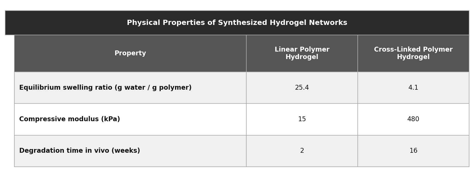
The cross-linked hydrogel had a higher equilibrium swelling ratio and a lower compressive modulus than the linear hydrogel.
The cross-linked hydrogel exhibited a lower equilibrium swelling ratio and a higher compressive modulus than the linear hydrogel did.
The cross-linked hydrogel absorbed almost no water, allowing it to withstand compressive stresses exceeding 1,000 kPa.
The linear hydrogel degraded in only 2 weeks, while the cross-linked hydrogel maintained its structural integrity for 16 weeks.
Explanation
This question asks which answer provides data supporting a specific hypothesis, so your first move should be to identify exactly what the chemist predicts. The hypothesis makes two claims: that cross-linking will lower the hydrogel's swelling ratio and increase its compressive modulus compared to a linear hydrogel, and both conditions must be satisfied by the correct answer. Choice D confirms both: the table shows the cross-linked hydrogel had a lower equilibrium swelling ratio (4.1 vs. 25.4 g water/g polymer) and a higher compressive modulus (480 vs. 15 kPa). Choice B is a tempting trap because it points in the right direction -- less water absorption, higher stress resistance -- but it exaggerates both values, claiming the hydrogel absorbed almost no water when the swelling ratio of 4.1 is a meaningful reduction but far from zero, and claiming stresses exceeding 1,000 kPa when the table shows 480 kPa. Choice C cites real, accurate data -- the degradation times of 2 and 16 weeks are both correct -- but degradation time appears nowhere in the hypothesis, making it entirely irrelevant evidence regardless of its accuracy. When you encounter hypothesis-support questions, always check whether each answer choice addresses the variables the hypothesis actually names -- accurate data about the wrong variable is just as wrong as fabricated data about the right one.
Which choice best describes data from the table that support the researcher's theory?
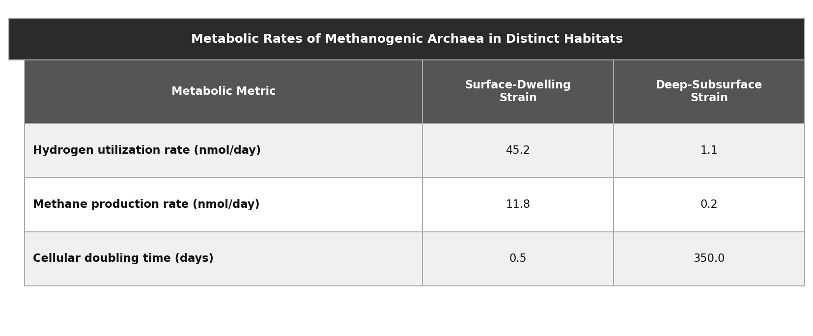
The deep-subsurface strain exhibited a longer cellular doubling time and produced less methane per day than the surface-dwelling strain.
The deep-subsurface strain had a hydrogen utilization rate of exactly zero, yet still produced methane at a rate of 0.2 nmol/day.
The surface-dwelling strain had a hydrogen utilization rate of 45.2 nmol/day, whereas the deep-subsurface strain had a cellular doubling time of 350.0 days.
The deep-subsurface strain utilized hydrogen at a lower rate and produced less methane per day than the surface-dwelling strain did.
Explanation
This question asks for data that support a specific theory, so begin by identifying exactly what the researcher predicts. The theory states that deep-subsurface strains will slow their metabolism by utilizing less hydrogen and producing less methane per day than surface-dwelling strains, meaning the correct answer must confirm both of these metabolic variables specifically. Choice C satisfies both requirements: the table shows the deep-subsurface strain had a lower hydrogen utilization rate (1.1 vs. 45.2 nmol/day) and a lower methane production rate (0.2 vs. 11.8 nmol/day). Choice A is a partial-support trap: it correctly notes that the subsurface strain had a longer doubling time and less methane production, but doubling time does not appear anywhere in the theory, and it omits hydrogen utilization, which is one of the two variables the theory explicitly names. Choice D is a sophisticated distractor that uses two accurate numbers pulled directly from the table (45.2 nmol/day and 350.0 days), but pairs a hydrogen value from one species with a doubling time value from the other, mixing variables across species without addressing either of the theory's actual predictions. When answering hypothesis-support questions, first identify every variable the hypothesis names, then eliminate answers that substitute different variables -- even real, accurate data points are irrelevant if they do not directly address what the hypothesis predicts.
Which choice best describes data from the table that support the geologist's hypothesis?
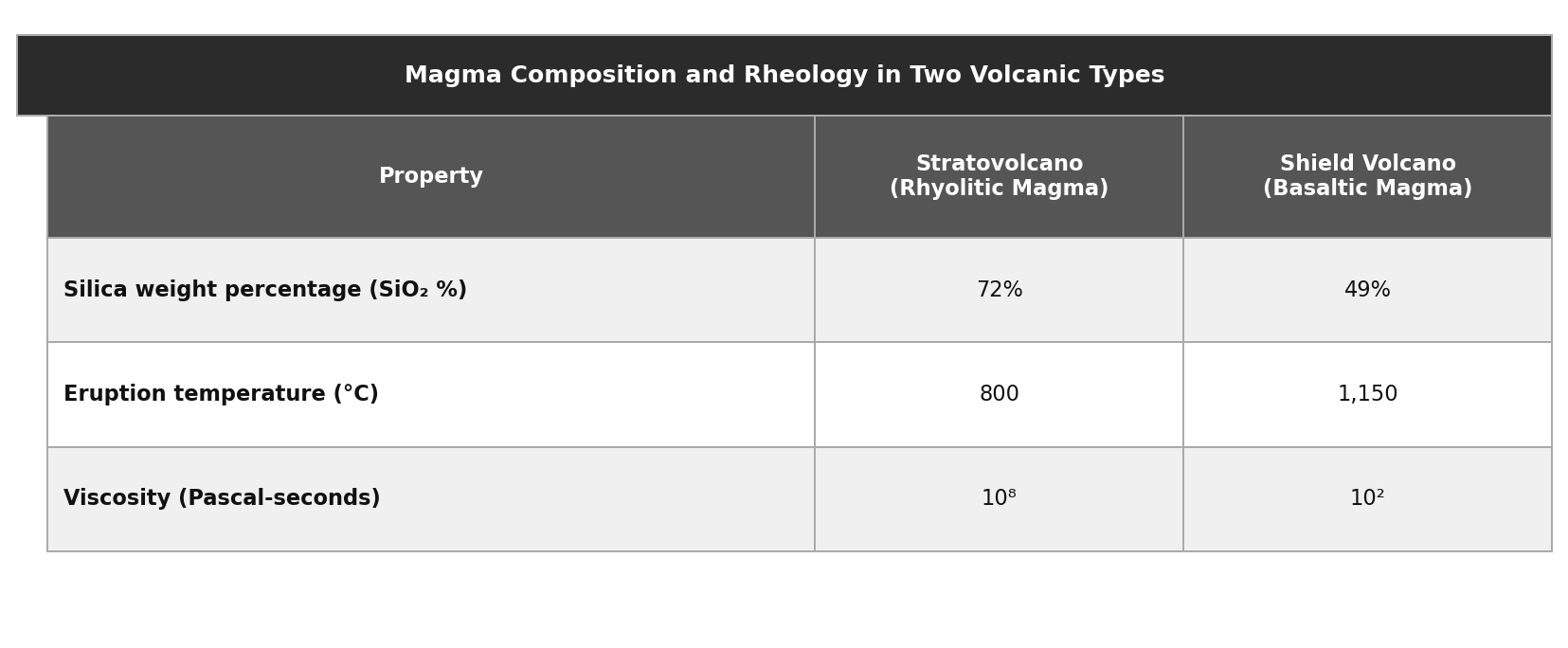
Shield volcano magma had a higher eruption temperature and a lower viscosity than stratovolcano magma.
Stratovolcano magma had a higher silica weight percentage and a significantly higher viscosity than shield volcano magma.
Stratovolcano magma was composed of nearly 100% silica, making its viscosity so high that it could not flow at all.
Both magma types possessed a viscosity over $10^5$ Pascal-seconds, but stratovolcano magma had a higher silica percentage.
Explanation
This question asks which answer provides data that support a researcher's hypothesis, so your first step is to locate and understand exactly what that hypothesis predicts. The geologist hypothesizes two specific outcomes: that rhyolitic stratovolcano magma will have a higher silica percentage and a substantially higher viscosity than basaltic shield volcano magma, meaning the correct answer must confirm both of these predictions. Choice B satisfies both requirements: the table shows stratovolcano magma has a higher silica weight percentage (72% vs. 49%) and a dramatically higher viscosity $(10^8$ vs. $10^2$ Pascal-seconds). Choice A is the most tempting distractor because it points in exactly the right direction -- high silica, extreme viscosity -- but it fabricates both values, claiming nearly 100% silica (actual: 72%) and viscosity so high the magma could not flow (the table gives a finite value of $10^8$ Pa-s, not an infinite one). Choice D is cleverly constructed: it correctly notes that stratovolcano magma has higher silica, but falsely claims both magmas have viscosities above $10^5$ Pa-s, when shield volcano magma is actually $10^2$, far below that threshold. When tackling hypothesis-support questions, always verify every numerical claim in each answer choice against the table -- fabricated or exaggerated values disqualify an otherwise appealing choice even when the directional logic is sound.
Which choice best describes data from the table that support the researchers' hypothesis?
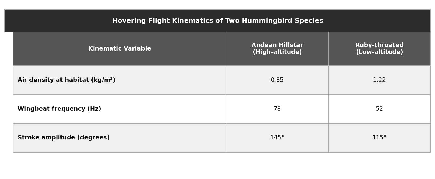
The Andean Hillstar experienced an air density of 0.85 kg/m3, while the Ruby-throated experienced an air density of 1.22 kg/m3.
The Andean Hillstar hovered with a wingbeat frequency of 78 Hz and a stroke amplitude exceeding 180 degrees.
The Ruby-throated hummingbird had a lower wingbeat frequency and a smaller stroke amplitude than the Andean Hillstar, consistent with its lower metabolic demands at sea level.
The Andean Hillstar exhibited a higher wingbeat frequency and a larger stroke amplitude than the Ruby-throated hummingbird.
Explanation
This question asks for data that support a specific hypothesis, so begin by identifying exactly what the researchers predict. The hypothesis claims that high-altitude Andean Hillstars compensate for thin air by maintaining a higher wingbeat frequency and a wider stroke amplitude than their low-altitude counterparts, meaning the correct answer must confirm both of these compensation mechanisms using table data. Choice D does exactly that: the table shows the Andean Hillstar had a higher wingbeat frequency (78 vs. 52 Hz) and a larger stroke amplitude (145 vs. 115 degrees). Choice A is a sophisticated trap because air density is real, accurate data from the table and it explains why compensation is necessary -- but the hypothesis predicts the compensation mechanisms themselves (frequency and amplitude), not the environmental condition that motivates them; citing air density alone establishes context, not support. Choice B is deceptive because it accurately reports the wingbeat frequency (78 Hz) but fabricates the stroke amplitude, claiming it exceeds 180 degrees when the table clearly shows 145 degrees. Whenever you see a hypothesis-support question, be careful to distinguish between data that explain why a hypothesis might be true and data that directly confirm its predicted outcomes -- only the latter qualifies as genuine support.
Which choice best describes data from the table that support the microbiologist's hypothesis?
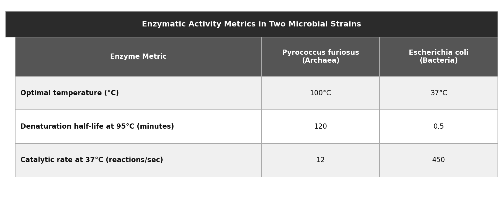
P. furiosus enzymes exhibited lower catalytic rates at 37 degrees C, demonstrating reduced function at moderate temperatures compared to E. coli enzymes.
E. coli enzymes had a lower optimal temperature and a higher catalytic rate at 37 degrees C than P. furiosus enzymes did.
P. furiosus enzymes had an optimal temperature of 100 degrees C and never denatured, whereas E. coli enzymes denatured almost instantly.
P. furiosus enzymes had a higher optimal temperature and a longer denaturation half-life at 95 degrees C than E. coli enzymes did.
Explanation
This question asks which answer choice provides data supporting a specific hypothesis, so you should identify that hypothesis precisely before evaluating the options. The microbiologist predicts two things: that P. furiosus enzymes will require higher temperatures for optimal function and will resist denaturation at near-boiling temperatures significantly longer than E. coli enzymes, and both conditions must be confirmed by the correct answer. Choice A satisfies both: the table shows P. furiosus has a higher optimal temperature (100 vs. 37 degrees C) and a much longer denaturation half-life at 95 degrees C (120 vs. 0.5 minutes). Choice B is a highly effective trap because it aligns perfectly with the hypothesis conceptually, but the claim that P. furiosus enzymes never denatured directly contradicts the table, which reports a half-life of 120 minutes -- a half-life, by definition, implies eventual denaturation, so never is factually inaccurate. Choice D introduces catalytic rate at 37 degrees C, which is real data from the table but appears nowhere in the hypothesis, making it an irrelevant variable regardless of whether the claim is accurate. When answering hypothesis-support questions, be especially alert to answer choices that sound scientifically compelling but overstate what the data actually show -- precise scientific terms like half-life carry specific meaning that rules out absolute claims like never.
Which choice best describes data from the table that support the astrophysicist's hypothesis?

Planets orbiting G-type stars have an average orbital distance of 1.05 AU, while planets orbiting M-dwarf stars have an average distance of 0.15 AU.
Planets orbiting M-dwarf stars had shorter average orbital periods and a significantly higher tidal locking probability than planets orbiting G-type stars.
Planets orbiting M-dwarf stars and G-type stars both had tidal locking probabilities over 50%, but M-dwarf planets had shorter orbital periods.
Planets orbiting M-dwarf stars have orbital periods measured in hours, making tidal locking almost mathematically certain.
Explanation
Because this question asks for data that support a hypothesis, your first priority should be to identify exactly what the astrophysicist predicts before looking at the answer choices. The hypothesis makes two specific claims: that M-dwarf planets will have shorter orbital periods and a drastically higher tidal locking probability than G-type planets, meaning the correct answer must confirm both of these predicted outcomes using table data. Choice C does exactly that: the table shows M-dwarf planets have shorter average orbital periods (24 vs. 365 days) and a substantially higher tidal locking probability (92% vs. 4%). Choice A is a compelling trap because it supports the right conceptual conclusion -- short periods lead to tidal locking -- but it states that M-dwarf orbital periods are measured in hours when the table clearly shows 24 days, making it factually wrong. Choice B is also tempting because orbital distance is genuinely relevant context in the passage, but the hypothesis specifically predicts outcomes for orbital period and tidal locking probability -- distance explains why the hypothesis might be true, but it does not directly test it. Whenever you see a hypothesis-support question, distinguish carefully between data that establish background conditions and data that directly confirm the predicted outcomes -- only the latter constitutes real support.
Which choice best describes data from the table that support the marine biologist's hypothesis?
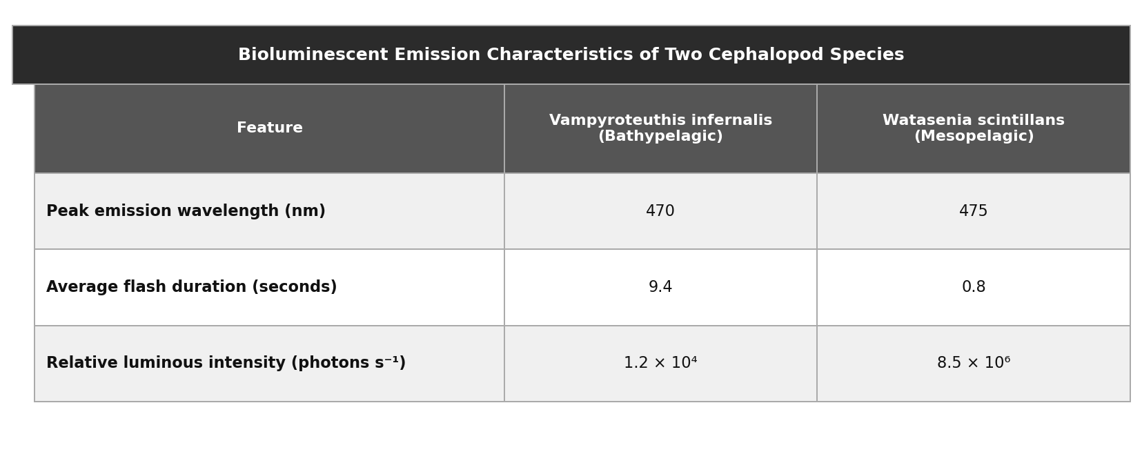
V. infernalis produced flashes that lasted several minutes, whereas W. scintillans produced flashes that lasted less than a second.
V. infernalis exhibited a longer average flash duration and a lower luminous intensity than W. scintillans did.
V. infernalis exhibited a longer average flash duration and a higher luminous intensity than W. scintillans did.
Both V. infernalis and W. scintillans emitted peak wavelengths around 470 nm, but V. infernalis had a lower luminous intensity.
Explanation
This question asks you to identify data that support a researcher's hypothesis, so your first move should be to locate and precisely understand that hypothesis before looking at the answer choices. The marine biologist hypothesizes two specific things about bathypelagic cephalopods (V. infernalis): that their flashes will be longer in duration and vastly less intense than those of mesopelagic cephalopods (W. scintillans), meaning the correct answer must confirm both the duration advantage and the intensity disadvantage. Choice B satisfies both requirements: the table shows V. infernalis had a longer average flash duration (9.4 vs. 0.8 seconds) and a lower luminous intensity (1.2 x $10^4$ vs. 8.5 x $10^6$ photons/s). Choice A is a strong trap because it correctly captures the directional relationship -- longer vs. shorter flashes -- but claims V. infernalis flashes lasted several minutes when the table clearly shows 9.4 seconds, making it factually inaccurate. Choice C is misleading because wavelength is real data from the table, but peak emission wavelength appears nowhere in the hypothesis, making it irrelevant evidence regardless of its accuracy. When asked to support a hypothesis, first identify the exact variables the hypothesis names, then eliminate any choice that introduces irrelevant variables or misrepresents the actual data values, no matter how conceptually appealing it sounds.
Which choice best describes data from the table that support the botanist's hypothesis?
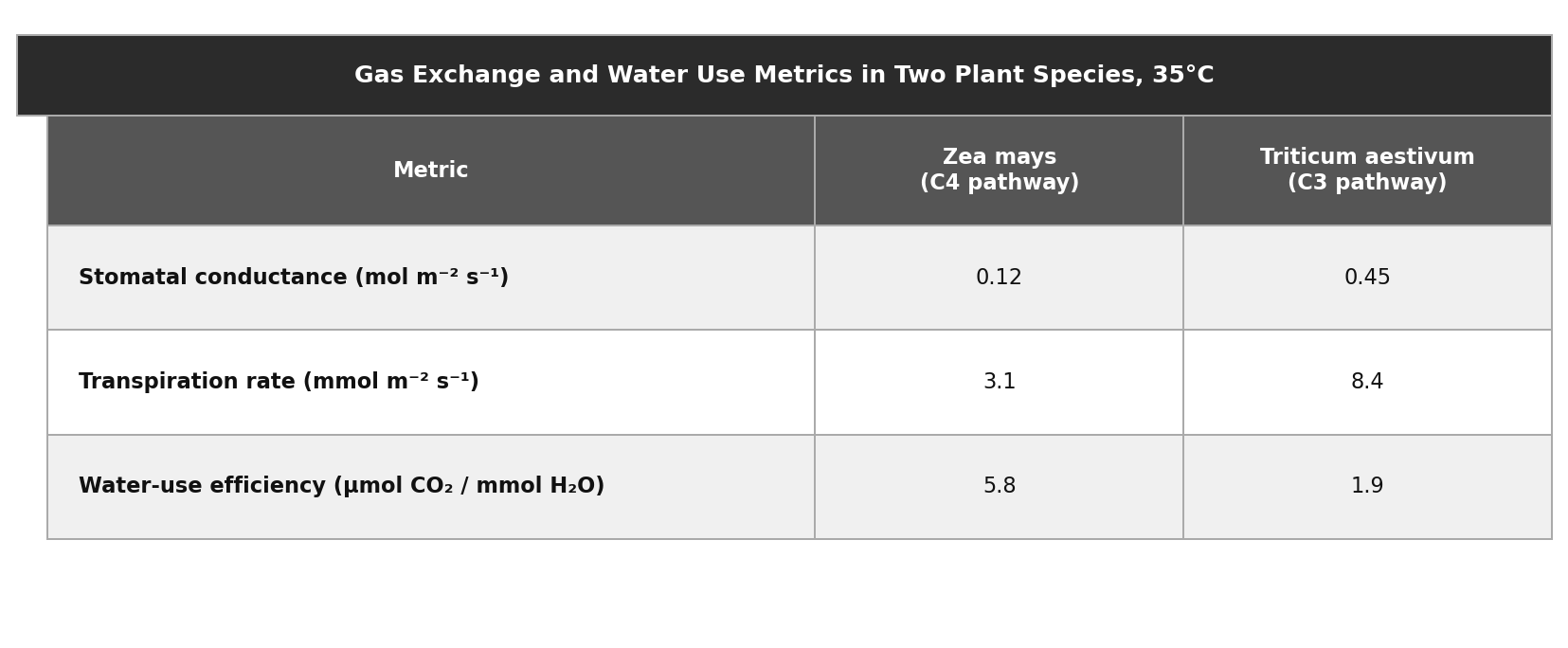
Z. mays had stomatal conductance and transpiration rates near zero, completely preventing water loss compared to T. aestivum.
Z. mays exhibited lower stomatal conductance and lower transpiration rates than T. aestivum, but a higher water-use efficiency.
T. aestivum exhibited higher stomatal conductance and a higher transpiration rate than Z. mays, but also a higher water-use efficiency.
Z. mays had a lower stomatal conductance than T. aestivum, suggesting reduced water loss under heat stress.
Explanation
This question asks which answer choice provides data that support a specific hypothesis, so the first step is to locate and precisely understand that hypothesis before evaluating the answer choices. The botanist hypothesizes three things simultaneously: that C4 plants (Z. mays) will show lower stomatal conductance, lower water loss (transpiration), and meaningfully higher water-use efficiency than C3 plants (T. aestivum) under heat stress, meaning the correct answer must address all three components. Choice C satisfies all three: the table confirms Z. mays had lower stomatal conductance (0.12 vs. 0.45 mol/m2/s), lower transpiration (3.1 vs. 8.4 mmol/m2/s), and higher water-use efficiency (5.8 vs. 1.9 umol CO2/mmol H2O). Choice A is tempting because it correctly identifies Z. mays's lower stomatal conductance, but it addresses only one of the three hypothesis components and omits transpiration and water-use efficiency entirely. Choice D is deceptive because its first two claims are accurate -- T. aestivum does have higher conductance and higher transpiration -- but it incorrectly awards T. aestivum the water-use efficiency advantage, which the table directly contradicts. On questions asking you to support a hypothesis, always begin by identifying every component of that hypothesis, then eliminate any answer that addresses only part of it or misrepresents the data -- the correct answer must account for the full claim, not just the most obvious piece.
A survey asked employees in four departments whether they were satisfied with their work-life balance. The company newsletter claims: “Satisfaction was highest in Engineering, at least 5 percentage points above Sales.” Which choice best describes data from the table that support the claim?
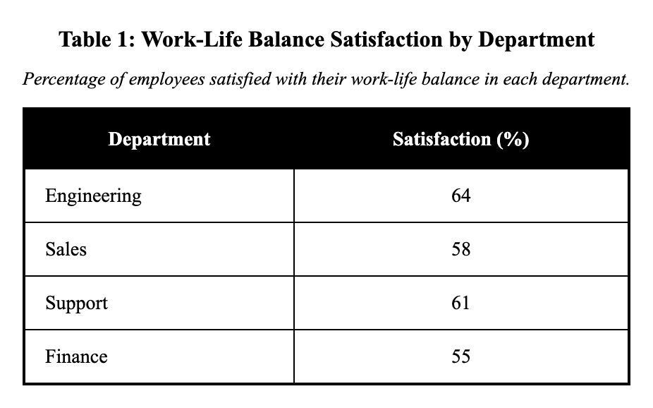
Finance is 6 points above Sales (55% vs 58%).
Engineering is 6 points above Sales (64% vs 58%).
Engineering is 3 points above Support (64% vs 61%).
Support is 3 points above Sales (61% vs 58%).
Explanation
The newsletter claims that satisfaction was highest in Engineering and at least 5 percentage points above Sales. From the table: Engineering has 64% satisfaction and Sales has 58%, giving a difference of 64 - 58 = 6 percentage points. Since 6 points exceeds the 5-point minimum claimed, choice A correctly supports this: 'Engineering is 6 points above Sales (64% vs 58%).' Choice B shows only a 3-point difference between Support and Sales, choice C compares Engineering to Support rather than Sales, and choice D incorrectly claims Finance is above Sales when it's actually below. When verifying comparative claims, ensure you're comparing the correct departments and that differences meet stated thresholds.
A climate summary listed average annual temperature (in °C) for a city across four years. A writer claims: “From 2021 to 2024, the city warmed overall by 0.9°C.” Which choice most effectively uses data from the table to support the claim?
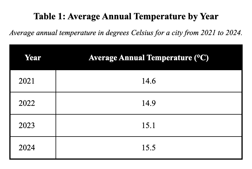
It rose from 14.9°C in 2022 to 15.5°C in 2024.
It rose from 14.6°C in 2021 to 15.5°C in 2024.
It rose from 14.6°C in 2021 to 15.4°C in 2024.
It rose from 14.6°C in 2021 to 15.1°C in 2023.
Explanation
The writer claims the city warmed overall by 0.9°C from 2021 to 2024, so we need to calculate the temperature change between these specific years. From the table: 2021 averaged 14.6°C and 2024 averaged 15.5°C, giving a difference of 15.5 - 14.6 = 0.9°C. Choice A correctly identifies this: 'It rose from 14.6°C in 2021 to 15.5°C in 2024.' Choice B uses 2022 as the starting year instead of 2021, choice C uses 2023 as the ending year instead of 2024, and choice D incorrectly states the 2024 temperature as 15.4°C when it's actually 15.5°C. When calculating overall change, always use the exact start and end points specified in the claim.