SSAT Elementary Level Math : Data Analysis
Study concepts, example questions & explanations for SSAT Elementary Level Math


All SSAT Elementary Level Math Resources
Example Questions
Example Question #11 : Draw Picture And Bar Graphs To Represent A Data Set: Ccss.Math.Content.2.Md.D.10
Kate's class is going to plant flowers outside of their class window. To help decide what flower to plant, her teacher took a class vote.
Use the graph below to help answer the question.
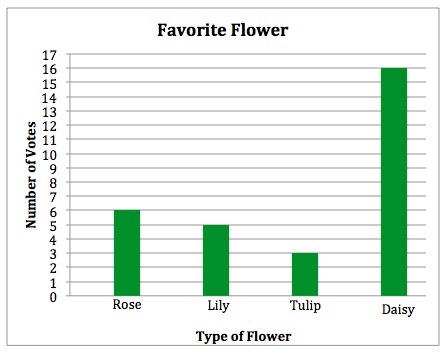
What is the label of the y-axis?
Class Votes
Kate's Class
Type of Flower
Number of Votes
Favorite Flower
Number of Votes
A graph is made up of an x-axis and a y-axis. The x-axis of a graph is always the horizontal line (a line that runs from left to right) and the y-axis is alway the vertical line (a line that runs from top to bottom)
The y-axis of this graph is labeled "Number of Votes".
Example Question #125 : How To Find The Answer From A Table
Kate's class is going to plant flowers outside of their class window. To help decide what flower to plant, her teacher took a class vote.
Use the graph below to help answer the question.
How many people voted for roses to be planted?


The bar for the rose is the first bar on the left. The bar raises to the number 

Example Question #126 : How To Find The Answer From A Table
Kate's class is going to plant flowers outside of their class window. To help decide what flower to plant, her teacher took a class vote.
Use the graph below to help answer the question.
How many people voted for tulips to be planted?


The bar for the tulip is the third bar from the left. The bar raises to the number 

Example Question #127 : How To Find The Answer From A Table
Kate's class is going to plant flowers outside of their class window. To help decide what flower to plant, her teacher took a class vote.
Use the graph below to help answer the question.
How many people voted for lilies to be planted?


The bar for the lily is the second bar from the left. The bar raises to the number 

Example Question #271 : Data Analysis And Probability
Kate's class is going to plant flowers outside of their class window. To help decide what flower to plant, her teacher took a class vote.
Use the graph below to help answer the question.
How many people voted for daisies to be planted?


The bar for the daisy is the fourth bar from the left. The bar raises to the number 

Example Question #12 : Draw Picture And Bar Graphs To Represent A Data Set: Ccss.Math.Content.2.Md.D.10
Kate's class is going to plant flowers outside of their class window. To help decide what flower to plant, her teacher took a class vote.
Use the graph below to help answer the question.
If Kate's teacher is going to plant the two flowers with the most votes, which two flowers will be planted?
Tulips and Roses
Lilies and Daisies
Roses and Lilies
Daisies and Roses
Daisies and Tulips
Daisies and Roses
The two bars that go up to the highest two numbers are the rose, which 

Example Question #273 : Data Analysis And Probability
Kate's class is going to plant flowers outside of their class window. To help decide what flower to plant, her teacher took a class vote.
Use the graph below to help answer the question.
How many people voted in Kate's class?


To find out how many totally peopled voted, we need to add up all of the votes that each flower received.

Example Question #381 : Measurement & Data
Kate's class is going to plant flowers outside of their class window. To help decide what flower to plant, her teacher took a class vote.
Use the graph below to help answer the question.
Two students who wanted to vote for the rose were absent on the day Kate's class voted. If the teacher counts their votes, how many people voted for the rose?


The rose started off with 


Example Question #131 : Tables
All of the 
Use the graph below to help answer the question.

What is the title of the graph?
Dollars Saved
Saving Money
Money Saved
Local Charity
2nd Grade Classes
Money Saved
The title of a bar graph can be found at the top of the graph, and it tells you what type of data the graph is displaying. In this case, our title is "Money Saved".
Example Question #132 : Tables
All of the 
Use the graph below to help answer the question.
What is the label of the x-axis?
Dollars Saved
Money Saved
Money to Donate
2nd Grade Classes
Local Charity
2nd Grade Classes
A graph is made up of an x-axis and a y-axis. The x-axis of a graph is always the horizontal line (a line that runs from left to right) and the y-axis is alway the vertical line (a line that runs from top to bottom)
The x-axis of this graph is labeled "2nd Grade Classes".


Certified Tutor

All SSAT Elementary Level Math Resources

